
Cromford Report
Market Insights for Agents & Clients!
Stay informed with the latest Cromford Report updates! We share expert insights helping both agents and clients navigate Arizona’s ever-changing real estate market. Whether you’re buying, selling, or advising others, staying on top of market trends is key to making smart decisions.
The Cromford Report is a Detailed Analysis of the Phoenix Metro Housing Market.
The data used to create the Cromford® Report is obtained from public records and obtained under license from the Arizona Regional Multiple Listing Service, Inc (ARMLS). Cromford Associates LLC and ARMLS expressly disclaim and make no representations or warranties of any kind, whether express, implied or statutory, as to the accuracy of the data used or the merchantability or fitness for any particular purpose.
August 2026
Mid-Month Pricing Update and Forecast
August 17, 2026
For the monthly period ending August 15, we are currently recording a sales $/SF of $292.77, averaged across all areas and types in the ARMLS database. This is down 3.6% from the $303.74 we measured for July 15. Our forecast range midpoint was $300.36, so although we predicted a significant fall, we underestimated it by a large margin. The median sales price has remained much more stable. The monthly median price currently stands at $449,900, down from $451,000 last month but up from $440,000 a year ago.
Because the luxury market is causing wild swings in average $/SF, we now prefer median price per square foot, which landed at $252.12. One month before, it read $254.86, and the same month last year was $251.19. Note how the measure didn’t jump all over the place like the average $/SF, showing how much the luxury market distorts the overall picture. So instead of the 3.6% month-to-month fall, the median $/SF shows a much smaller 1.1% drop and still a 0.4% increase over the same month last year.
On August 15, pending listings across all areas and types averaged $ 319.71/SF, up 0.6% from the July 15 reading. The median $/SF is $253.42, down from $255.10 a month earlier.
Notice that:
The median is substantially below the average (due to the luxury distortion being removed)
The median went down 0.7% while the average went up 0.6% – opposite signals
From now on, we will be using the median $/SF to create our one-month forecast. We expect this will improve our accuracy, but we will see.
Our forecast for September 15 median $/SF is $251, with an 80% confidence range of $249 to $254. For the median sales price, we forecast $448,000 with an 80% confidence range of $445,000 to $456,000.
This suggests that closed prices are likely to fall slightly over the next month, though less than over the last month. We are in the middle of the summer season, which tends to be the weakest period of the year in Greater Phoenix. No prizes for guessing why.
Among listings under contract, 94.6% are normal, 1.5% are REOs, and 3.9% are pre-foreclosures (including a very small number of short sales). Distress is noticeably higher than last month and, though it remains low compared to the 25-year average, we are seeing a distinct upward trend in pre-foreclosure activity. Lender-owned listings remain low, suggesting that many pre-foreclosures are being resolved by sale before the trustee has to step in.
Normal listings represented 97.5% of listings under contract 12 months ago, so distress has clearly risen, which should serve as an early warning. However, we must keep it in perspective: between 2011 and 2012, the normal percentage was below 25%, and between 2013 and 2019 we averaged 85% normal. We are still better off than during that period, but the improving trend has reversed since 2022, especially in the last 6 months, and is now quietly flashing amber instead of green.
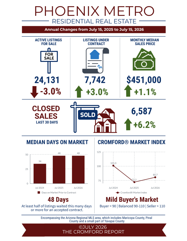
July 2026 - Infographic
-
The Greater Phoenix housing market remained in a mild buyer's market entering July, with little overall change. The Cromford® Demand Index and Cromford® Supply Index both declined at similar rates over the past 30 days, largely offsetting each other's influence on pricing trends. June closed sales in the Arizona Regional MLS totaled 6,602, up 7.0% from last year, with a 4% increase in sales under $800,000 (equivalent to an extra 221 sales) and a 23% increase in sales over $800,000 (equivalent to an extra 209 sales). Despite stronger sales, prices remained relatively flat below the $1 million price point. Homes priced below $300,000 recorded an average sales price decline of 1.3% compared with last June. Homes priced between $300,000 and $800,000 experienced average price-per-square-foot declines of less than 1%. Meanwhile, homes over $1 million posted modest gains of roughly 1.5% to 2%. This is in stark contrast to recent national headlines stating that home prices set new records in June. If we use the average sales price, then that headline holds true, but the median sales price has not reached a record high and has been stagnant for the last couple of years. What’s the difference? In the housing market, averages will skew high when luxury sales are strong. For example, the average sales price over the last 30 days in the MLS was $622,000. This can create the impression that the typical buyer is spending that much on a home. In reality, only 27% of buyers purchased homes at or above $622,000, while 73% purchased below that figure. The median sales price of $451,000 is $171,000 lower than the average. This means half of all buyers purchased a home for $451,000 or less over the past 30 days, making the median a much better representation of the typical transaction. This is also not a record high as it remains nearly $30,000 below the peak median price of $480,000 recorded in May 2022. Bottom line, don’t assume that home values are currently soaring everywhere, or that luxury sales are causing all home values to rise. It's simply the difference between averages and medians. Historically, home values have not outperformed the rate of inflation in a buyer’s market. In fact, homeowners who purchased within the past 4½ years have generally accumulated little appreciation-based equity. Greater Phoenix income growth, however, has outpaced both inflation and home appreciation for three consecutive years.
Commentary written by Tina Tamboer, Senior Housing Analyst with The Cromford Report ©2026 Cromford Associates LLC and Tamboer Consulting LLC
-
Now that the ROAD to Housing Act is law, its effects are unlikely to be felt immediately in the mainstream resale housing market in Greater Phoenix. Most of the changes are structured to reduce construction costs, ease regulations and increase financing options through community banks and updated HUD programs. Other provisions expand grants and forgivable loans for improving aging housing stock, such as aging single family homes owned by low-to-moderate income households. It also prohibits institutions from owning more than 350 homes (with exceptions), which will mitigate risk of future price bubbles but will not have much effect today due to low institutional participation in resale purchases. As far as spurring new home development in Greater Phoenix, don’t expect it to happen overnight. Builders are painfully aware of what happens when too much supply is added to the market before demand increases. There are other ways to improve affordability without devaluing existing resale homes nearby. To date, new home permits remain 37% below their 2021 peak, in line with the pre-Covid 2019 rate, and total MLS supply is considered normal. The outlying cities where builders operate are in buyer’s markets while established internal cities are in weak-to-moderate seller’s markets. Expect builders to proceed with caution, but with better flexibility to ramp up construction once demand improves. In the meantime, it’s business as usual for the resale marketplace. The median time on market before contract is 48 days, 55% of closings involved seller-paid closing costs last month, and buyers are negotiating within 97% of list price on average. Condition and competitive pricing are key to keeping marketing times short. The second half of the year is not typically as robust with buyer activity as the first half, so expect marketing times to get a little longer through the remainder of the summer. Lower mortgage rates would certainly boost demand, but sellers should not base their pricing or marketing strategy on that possibility.
Commentary written by Tina Tamboer, Senior Housing Analyst with The Cromford Report ©2026 Cromford Associates LLC and Tamboer Consulting LLC
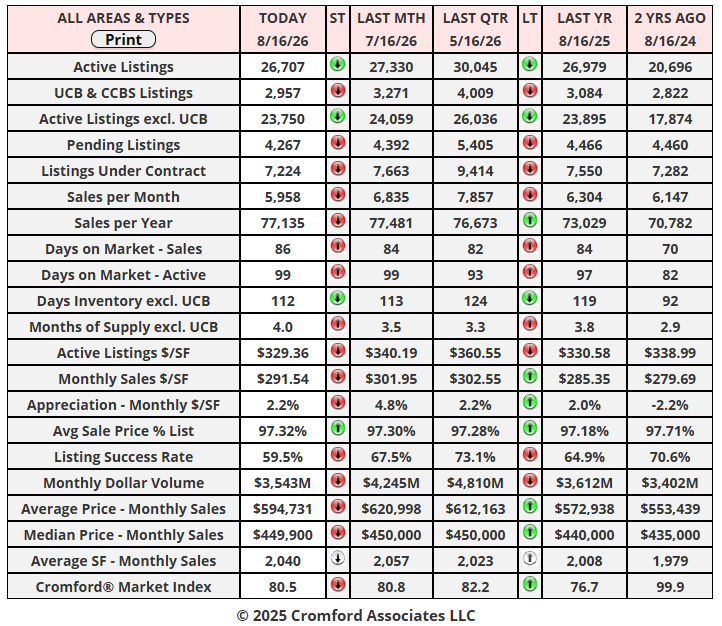
Cromford Market Snapshot - August 16, 2026
CMI Large City Ranking Table August 13, 2026
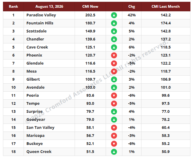
The average CMI is up 2.1% from last month. This is slightly more favorable for sellers than last week’s 1.8%, but almost all the heavy lifting was done by Paradise Valley. The reason PV has an unusually high CMI right now is that half the listings we had in May have disappeared. 98 listings have been canceled in the last 3 months, while another 27 expired. This is more than the number of closings (94). Fountain Hills, Scottsdale, and Cave Creek all improved as well for similar but less dramatic reasons.
The rest of the market is still suffering from weak demand, but the Southeast Valley has stabilized somewhat.
The number of cities moving in a direction favorable to sellers is 10, which is 2 more than last week. We have 8 moving in a direction that is favorable to buyers. The most movement for buyers is in Buckeye, Peoria, Glendale, and Tempe.
We once again have 8 cities in a seller’s market, 4 balanced, and 6 in a buyer’s market.
Price Analysis: Part Three – A Longer-Term View
August 12, 2026
In our last two posts, we studied the weak period in the housing market that has lasted since the froth of the COVID frenzy blew away. Using the most recent price peak as the baseline means almost all methods of measuring home prices show a gloomy picture because, by definition, we started at the top of the market, which, for the vast majority of segments, was in the second quarter of 2022. Gloom should really be confined to home sellers, however, because from a home buyer’s perspective, their target homes have become far more affordable. Median incomes have grown substantially since mid-2022, and home prices have mostly gone down or stabilized. This is especially true in the lower tiers of the market. Only at the luxury end of the market have we seen substantial rises in home prices since mid 2022 in Greater Phoenix.
The buyers who purchased in the first half of 2022 are the ones who suffered the worst effects of this recent price trend. If you remember this 6-month period, the majority of buyers during those crazy months were iBuyers and institutional investors. Normal buyers could barely get a look-in as each home got dozens of offers. We are probably not going to shed a tear for them.
Let us now look at price movements over 2 longer periods – 10 years from 2016 to 2026 (August in both cases) and 7 years from 2019 to 2026 (also August to August). The start dates were times when the market was positive but not frenzied, so this analysis should result in a more realistic vision of what has happened to home prices over 2 longer terms.
This process has underscored a couple of principles that we have acknowledged for some time.
Using price bands as a segmentation device is popular, but less than ideal because, over a long period, a large number of houses migrate from one band to another.
A better segmentation device is home size. Bigger homes tend to be more expensive than smaller ones, but homes do not tend to drift from one size band to another. The primary exception is when a small and old property is demolished to make way for a far grander replacement. This type of action is concentrated in Paradise Valley and Arcadia, where 16% to 18% of transactions involve a scrape and new build. An analysis of these 2 areas shows that it has a distorting effect on all price measurements. However, the median price per square foot is affected the least of all and remains largely undistorted. And in the rest of Greater Phoenix, fewer than 1.3% of transactions involve a complete rebuild.
So let us continue by using home size instead of price range as the segmentation. We will focus on single-family detached homes. Other types of homes have lost market share over this period, so including them would distort the picture a little more than we like.
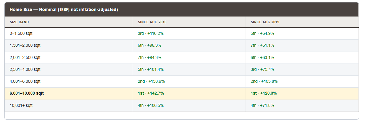
Over ten years, we can confirm a very substantial increase in nominal median price per square foot since August 2016, with much of that happening after August 2019. We have already seen that most of the increase took place between 2020 and 2022. Nevertheless, in nominal terms, most homes more than doubled in price over the last 10 years.
We also notice several other things:
Homes over 6,000 square feet but below 10,001 won the competition easily over both periods.
Homes between 4,001 and 6,000 square feet came second over both periods.
Smaller homes of 1,500 square feet and under did well in the first 3 years but much less well from 2019 onwards.
The most common size of all, 1501 to 2,000 square feet, underperformed the rest of the market.
Homes over 10,000 square feet have appreciated substantially less than the range below them.
Before we get too excited, let us look instead at real $/SF, the above numbers adjusted for inflation by applying the Consumer Price Index and expressing all dollars in their June 2026 value.
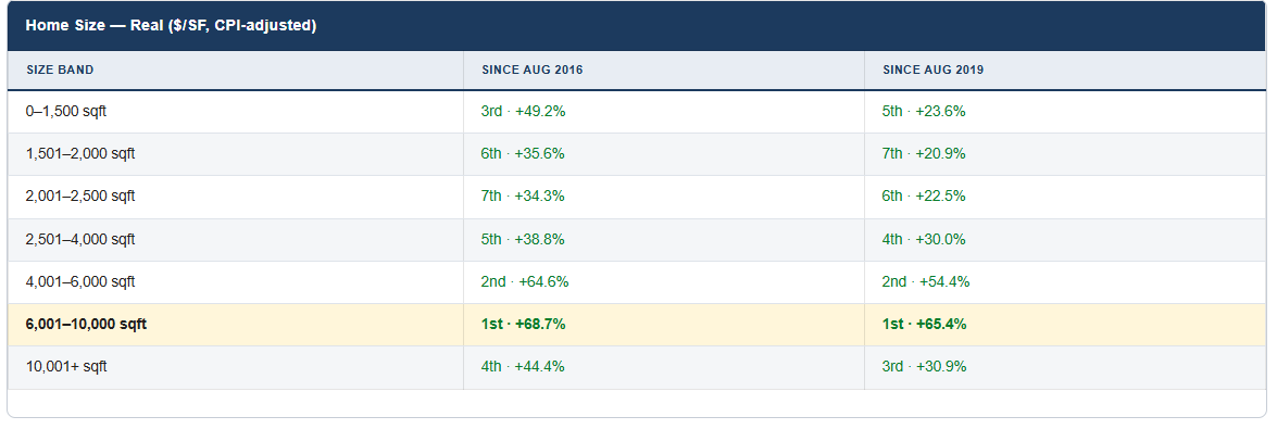
These are all positive numbers, so over the longer-term 7-year and 10-year views, we have clear evidence of substantial appreciation even after inflation. The size bands are also closer together in that appreciation, though the 6,001 to 10,000 range is still first, with 4,001 to 6,000 in second place. It also suggests that going for a home over 10,000 sq. ft. might not be quite as rewarding an investment as one below 10,000 sq. ft.
Finally, since the first 2 posts in this series used price range as segmentation, let us re-examine the August 2022 to August 2026 period using home size instead. Adjusting for inflation, home prices have moved downwards except for homes between 4,001 and 10,000 square feet.
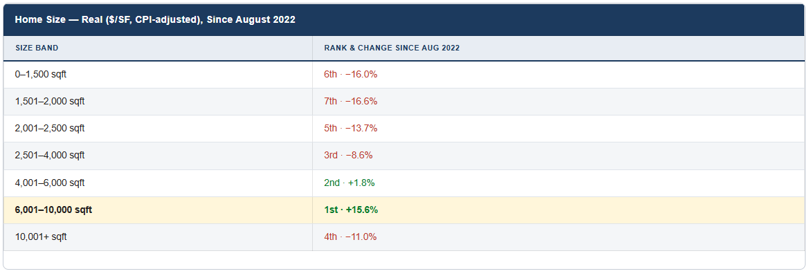
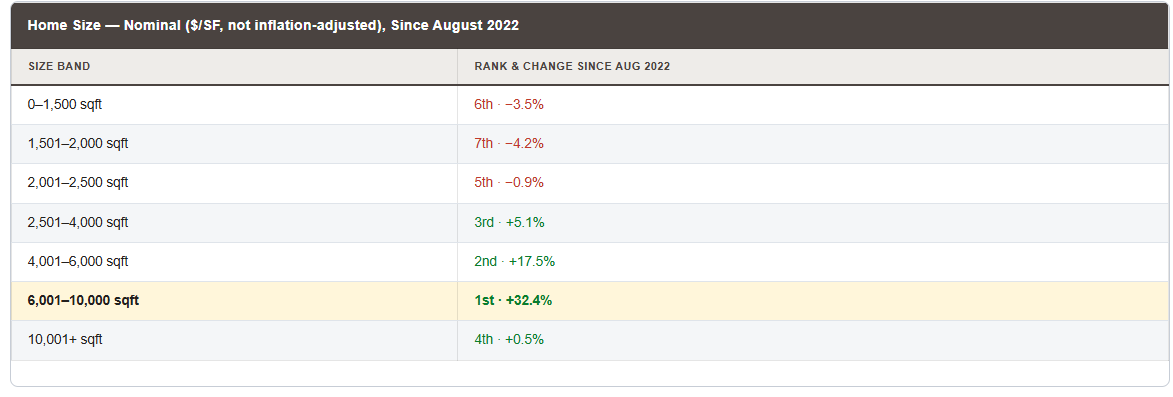
Starter homes, those under 2,000 square feet, have become substantially cheaper relative to inflation, down 16% to 17%. As you move upwards in home size, the picture improves until you reach 10,000 sq. ft. At the top end, over 10,000 sq. ft. homes begin to lose ground again, though this looks a lot less obvious when you convert to nominal dollars.
For completeness, here is the equivalent table in nominal dollars per square foot:
Cromford Market Snapshot - August 10, 2026
Prices Since the Peak: Part Two
August 9, 2026
Yesterday we sliced Greater Phoenix by dwelling type. This time we slice it by geographic region, single family detached only, and two regions refuse to follow the script everyone else stuck to.
Same method as yesterday: median $/SF (not average, not price), each closing’s own square footage doing the dividing, each region’s own peak month located rather than assumed. If you skipped yesterday’s Part 1, the short version is that median $/SF is the one number a luxury tail and a mix-of-home-sizes can’t quietly distort out from under you. We’re using it again here for the same reason.
Same Story, Eight Different Regions
Six of Greater Phoenix’s eight regions peaked right where you’d expect and have been sliding ever since. Two didn’t. The Northeast Valley and Central Phoenix kept climbing for years after the rest of the market had already turned, and the Northeast Valley in particular is sitting barely below where it stood back in May 2022.
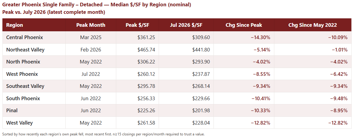
The Northeast Valley is the outlier of outliers here: down just 1% from where it stood in May 2022, and it only touched its own all-time high two months ago. Central Phoenix took a different path to the same place, it kept rising past its May 2022 level for nearly three more years, peaked in March 2025, and has only recently started giving that back. Everywhere else, the peak came and went in the first half of 2022, right on schedule.
The Inflation Reality Check
Here’s where it gets less flattering for those two “resilient” regions. Restate every closing into today’s dollars using the Phoenix CPI, the same way we did in Part 1, and the story tightens up considerably.
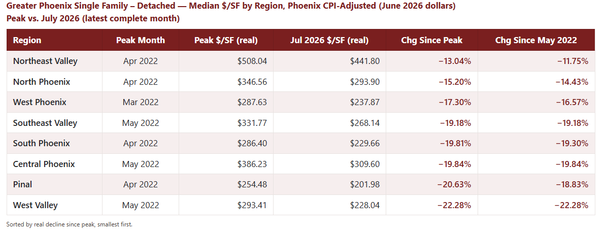
Once inflation is stripped out, every region’s real peak lands within about six weeks of each other, March through May 2022. Central Phoenix and the Northeast Valley weren’t genuinely gaining real value for years after everyone else stopped, but they were running just fast enough to keep pace with the cost of living, and the Northeast Valley barely even managed that. The real declines are also far more uniform than the nominal table suggested, thirteen to twenty-two percent across the board, instead of the four-to-fourteen percent spread that made a couple of regions look almost untouched.
Nominal dollars can make a region look like it dodged the correction. Real dollars mostly just show it running to stand still.
So Is the High End Actually Different?
We know that the skew between average and median $/SF has been widening because the top of the market is buoyant while everything beneath it slowly sinks. The Northeast Valley and Central Phoenix, both disproportionately home to the region’s priciest listings, hinted at it. So we isolated the actual luxury tier directly: every Single Family Detached closing over $2,000,000, set against everything under it.

There is the evidence. The under-$2M market is down over 10% from its May 2022 high, the same as every “normal” region we looked at above. But the $2M+ tier is up nearly 5% since May 2022, and still only 6.5% off an all-time high it set two months ago. Two completely different markets, moving in opposite directions.

Even the real numbers back this up, and they back it up in a more interesting way than the regions did. The under-$2M market’s real peak is May 2022, exactly where the nominal peak sits, and it’s down nearly 20% in real terms since. The $2M+ tier’s real peak isn’t May 2022 at all; it’s January 2023, eight months later. That’s not a segment running to keep pace with inflation. That’s a segment that kept genuinely gaining real value for the better part of a year after the rest of the market had already turned over, and even now, its real decline from that later peak (12%) is barely more than half of what the broader market has given back (20%).
One more data point is crucial: the $2M+ tier isn’t just holding its price better, it’s also transacting more often. Monthly closings in that segment averaged 115 a month in 2022; year-to-date in 2026 that’s up to 178 a month, a 55% increase in volume. Whatever is happening at the top of the market, it isn’t a shrinking pool of buyers propping up a thin, illiquid segment. More buyers are showing up for it than three years ago. We presume they are using profits from the stcok market or exercising their stock options and, probably wisely, diversifying into some rather nice real estate.
Conclusions
Six of eight Greater Phoenix regions, and the entire under-$2M Single Family Detached market with them, peaked in the first half of 2022 and have been giving up ground in real terms ever since, roughly 13 to 22% after adjusting for inflation, depending on where you look. The $2M+ tier is a different market: it kept gaining real value into early 2023, it’s still near an all-time high in nominal terms, and more buyers are closing on it than at any point in the last four years. So we have two different markets, and averaging them together is exactly what is making the average versus median skew far larger than is normal.
Why Median $/SF Doesn’t Lie (and What It Says About Phoenix Since May 2022)
August 8, 2026
Averages are for people who don’t want to know the truth. Here’s why we measure the market the way we do — and what four years of real numbers say about where your dwelling type actually stands since the peak.
The Case Against Averages (and Half of Medians)
There are four common ways to measure what homes are actually selling for, and three of them are lying to you at least a little. Let’s meet the lineup.
Average price is the one to distrust most. One $8 million Paradise Valley estate closes, and suddenly the “average” home in your ZIP code just got $40,000 more expensive, even though not a single normal house changed in value. Averages get dragged around by whatever sits in the upper-end tail, and in a market with a genuine luxury boom, the tail has been doing a lot of wagging lately. Beware of anyone quoting averages. In math, average means mean, but it does NOT mean typical.
Median price fixes the mansion problem. It just reports the home in the exact middle, immune to how rich the top 1% happen to be that month. But it has a quieter and more subtle flaw: it doesn’t know the difference between “homes got more expensive” and “bigger homes happened to sell this month.” If townhomes have a slow month and 4-bedroom Chandler SFRs have a hot one, the median price rises even though nothing about per-square-foot value moved at all. Median price answers “what’s a typical sale,” not “what’s a typical home worth.”
Average price per square foot gets closer; dividing by size at least controls for the mix-of-homes problem. But it’s still an average, so it still gets pulled around by outliers. We checked this directly on our own numbers a few weeks back: in July, 62% of Greater Phoenix closings sold for less than the average $/SF. Not close to half – 62%. That’s what happens when a resurgent luxury tier pulls the average upward while the rest of the market treads water or sinks beneath it. We measured the skew itself: three years ago the average ran about 8% above the median; today it runs over 10% above it, and touched nearly 13% this past January. The gap between “average” and “typical” has been quietly widening the whole time. This is why we are less comfortable with using the average $/SF than we used to be.
Median price per square foot is the one that survives both problems. Divide by size, so a slow month for big houses doesn’t fake a price move. Take the median, not the mean, so one compound in Silverleaf doesn’t speak for the other 6,000 closings that month. It’s the closest thing to “what did a typical square foot of a typical home actually sell for,” which is the only question most buyers and sellers actually care about. It’s the metric we used for everything below. We have not used it before because it is less well-known, and until 2026 it was much harder to persuade Tableau and Excel to calculate it accurately.
And here’s the part nobody likes to hear: median $/SF has no marketing department, and its average-based cousins do. Take the average of anything witha luxury tail – price, or price per square foot – and the tail pulls the average above the median every time. We measured both. Average price has been running 31–37% above median price over the last three years (31.1% three years ago, 34.1% two years ago, 36.5% over the last twelve months), and the gap is getting wider. Average $/SF runs the same way but by a smaller margin, about 8–10% above median $/SF, because dividing by square footage already strips out half of what was inflating the average price figure: it can’t get fooled by size anymore, only by rate. Average price gets fooled by both a rich buyer and a big house; average $/SF only gets fooled by the rich buyer. Median $/SF is the one number immune to both. When it reads lower than the figure your neighbor is quoting from a headline, that’s not the metric gaslighting you; it’s the average, doing what averages do when the top of the market is running away from the rest of it.
So why hasn’t this been our headline number all along? Average $/SF and median price are each one line of SQL, and Tableau will hand you either from asingle drag-and-drop. Until the recent boom in luxury homes, they seemed adequate and had the advantage of simplicity. Median $/SF is much messier. It makes you divide price by size on every individual closing before you’re allowed to touch an aggregate function. It is relatively heavy lifting, and until recently any median $/SF charts would have been much slower to render, which is not a popular thing with our subscribers. It has only been in the last few months that we have used median $/SF, once the programming tools we use got powerful enough to make the complex numbers no harder to pull than the easy ones. Going forward, you can expect us to focus more on the median $/SF, especially in the new website launching later this year.
So, Since the Peak …
May 2022 gets treated as the top of the market in mostconversations, and for the two dwelling types that make up most of Greater Phoenix’s volume, that’s exactly right. But not every category peaked on cue — and once you strip out four years of inflation, the story gets considerably less flattering for everyone.
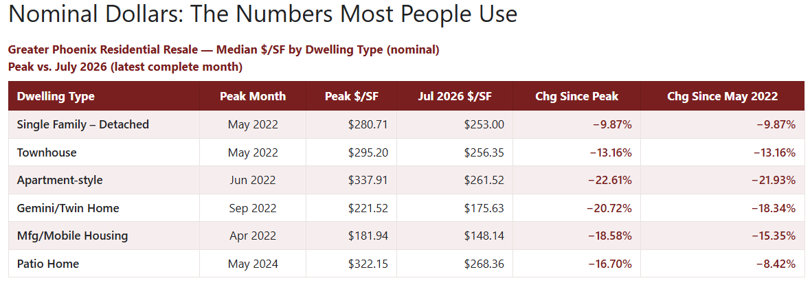
Loft Style and Modular/Pre-Fab were omitted because there are too few monthly closings for a reliable median.
Single Family Detached, by far the biggest category and the one that shapes most people’s mental image of “the market,” is also the most resilient, down under 10% from its own peak. That’s a big part of why May 2022 feels like the peak in the popular imagination: the category with the most closings set the tone.
Apartment-style units took it the hardest, down over 22% from their own high. And Patio Home is the outlier that breaks the whole “everyone peaked in May 2022” narrative: it kept climbing for two more years and didn’t top out until May 2024. Judge it against May 2022 like everything else, and it looks like it barely moved, down just 8%. Judge it against its own actual peak, and it’s down almost 17%, comparable to the twin homes and mobile/manufactured housing around it.
The lesson: “since the peak” only means something if you know when your peak actually was. For half these categories, it wasn’t May 2022.
Real Dollars: The Numbers That Actually Matter
Here’s the part that nominal prices hide from you. A dollar today buys less than a dollar did in May 2022, a lot less, after the run of strong inflation we’ve all lived through. So even a home that’s still fetching the “same price” it did four years ago has quietly lost real value the whole time. To see the true picture, we restated every closing’s own price per square foot into today’s dollars – June 2026 dollars – using the Phoenix Metro Consumer Price Index (CPI), before computing anything. Not by inflating the finished chart afterward; every single closing gets adjusted using its own month’s cost of living, then we take the median $/SF.
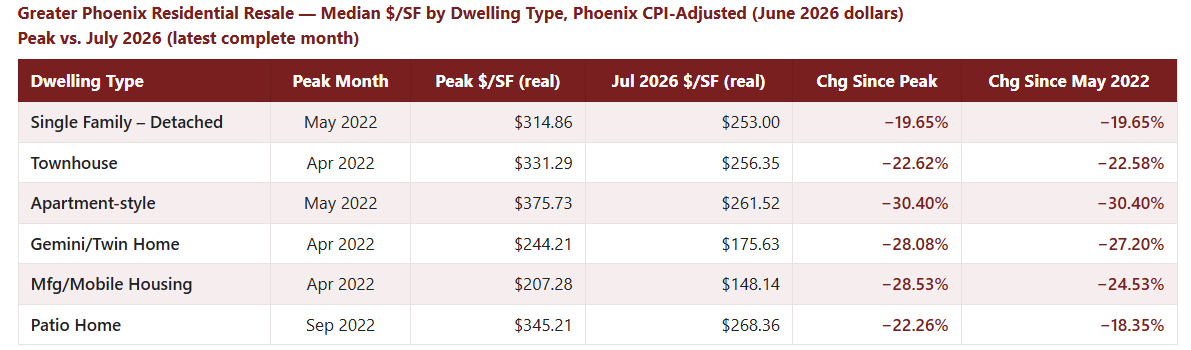
National CPI tells nearly the identical story (Single Family −21.11%, Apartment-style −31.67%, Patio Home −24.77% from its own peak), but we’re using the Phoenix-area series above since it reflects our own local cost of living rather than a national blend; the picture doesn’t really change much based on which CPI data you prefer.
Two things jump out immediately. First, every single category’s real decline is dramatically worse than its nominal one. We’re talking 20% to 30% down in real terms, against 10% to 23% nominal. Prices that “held up” in the headline number were quietly losing a fifth to nearly a third of their real worth the entire time. If you already thought inflation was a bad thing, now you know it is.
Second, look what happens to Patio Homes once you strip out inflation. Their real peak wasn’t May 2024 after all. It was September 2022, a few months behind most of the pack, which mostly topped out in April and May 2022, but a full 20 months ahead of where the nominal chart said they peaked. Everything between September 2022 and May 2024 wasn’t a gain at all; it was Patio Homes running just fast enough to keep up with the cost of living, and not one step further. Once you account for that, they are still down over 22% from their own real high, closer to the rest of the field than the standout survivors they looked like in nominal dollars.
The Takeaway
Single Family Detached remains the most resilient category in Greater Phoenix by a comfortable margin, in both nominal and real terms — but “most resilient” still means down roughly a fifth in real purchasing power since the peak. Apartment-style units have had the roughest ride of the categories with reliable volume. The high-end luxury market is a different animal entirely, and we will look at it in a forthcoming observation.
CMI Large City Ranking Table August 6, 2026
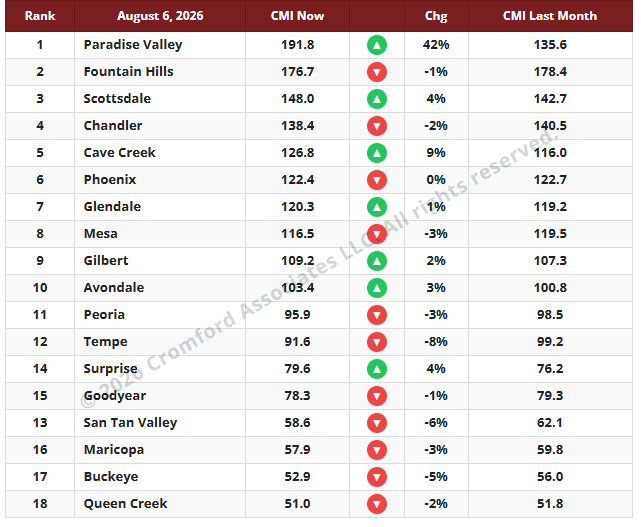
The average CMI is up 1.8% from last month. This is more favorable for sellers than last week, but it is all due to the expensive end of the market, where active listings are reduced for the summer but demand remains healthy. The rest of the market is still suffering from weak demand that is drifting slightly downwards as interest rates rise.
The number of cities moving in a direction favorable to buyers is eleven once again. We have seven moving in a direction that is favorable to sellers. Among these, Paradise Valley stands out for sellers with an even more extreme +42%, with Cave Creek far behind at +9% and the rest at +4% or less. Paradise Valley has now opened up a large lead over Fountain Hills, with Scottsdale third.
In the other direction, San Tan Valley (-6%) and Tempe (-8%) are the pacemakers.
We once again have 8 cities in a seller’s market, 4 balanced, and 6 in a buyer’s market.
Maricopa Affidavit Statistics for July 2026
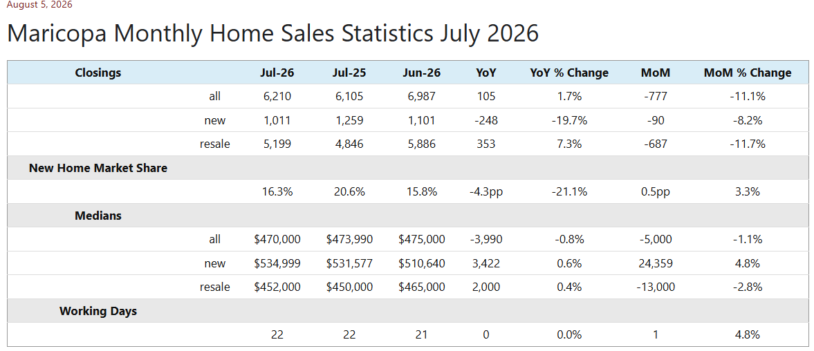
July 2026 had 22 working days, the same as July 2025 but one more than June 2026. This means the year-over-year comparison needs no calendar adjustment, while it would be fair to expect about 5% more closings than in June. Total closings came in at 6,210, up 1.7% year-over-year, and because the working days match exactly, that is a genuine gain rather than a calendar effect. Resale closings did all the work, up 7.3%, while new home closings fell substantially by 19.7%. The month-over-month picture is far less encouraging: closings dropped 11.1% despite July’s extra working day, which amounts to a decline of more than 15% once we adjust for the calendar.
New home sales have underwhelmed for several months in succession, and July brought no relief whatsoever. Having favored new homes in 2024 and 2025, buyers have continued to shift toward re-sales during 2026, and the gap is widening rather than closing.
The overall median sales price was $470,000, down 0.8% from July 2025 and 1.1% from June. In nominal terms, we can regard this as close to flat, but once we account for inflation, homes have again become more affordable relative to median earnings. Prices reversed last month’s pattern, with the new home median rising 4.8% month-over-month to $534,999 while the resale median fell 2.8% to $452,000. Given how sharply new home volume dropped, a shift in the mix of new homes that closed toward the high end provides the explanation, rather than genuine price strength among new homes.
New homes accounted for 16.3% of the Maricopa County market in July, down from 20.6% this time last year. That is a 4.3 percentage-point decline, meaning new homes have given up more than a fifth of their market share in twelve months. The one crumb of comfort for builders is that share edged up from June’s 15.8%. We anticipate closing volumes staying soft through August and September, with the median drifting slightly lower in nominal terms, though the usual seasonal change in mix should lend some support to prices from October onwards.
Market Summary for the Beginning of August 2026
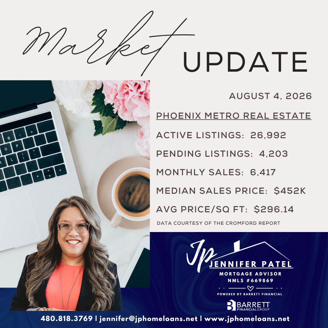
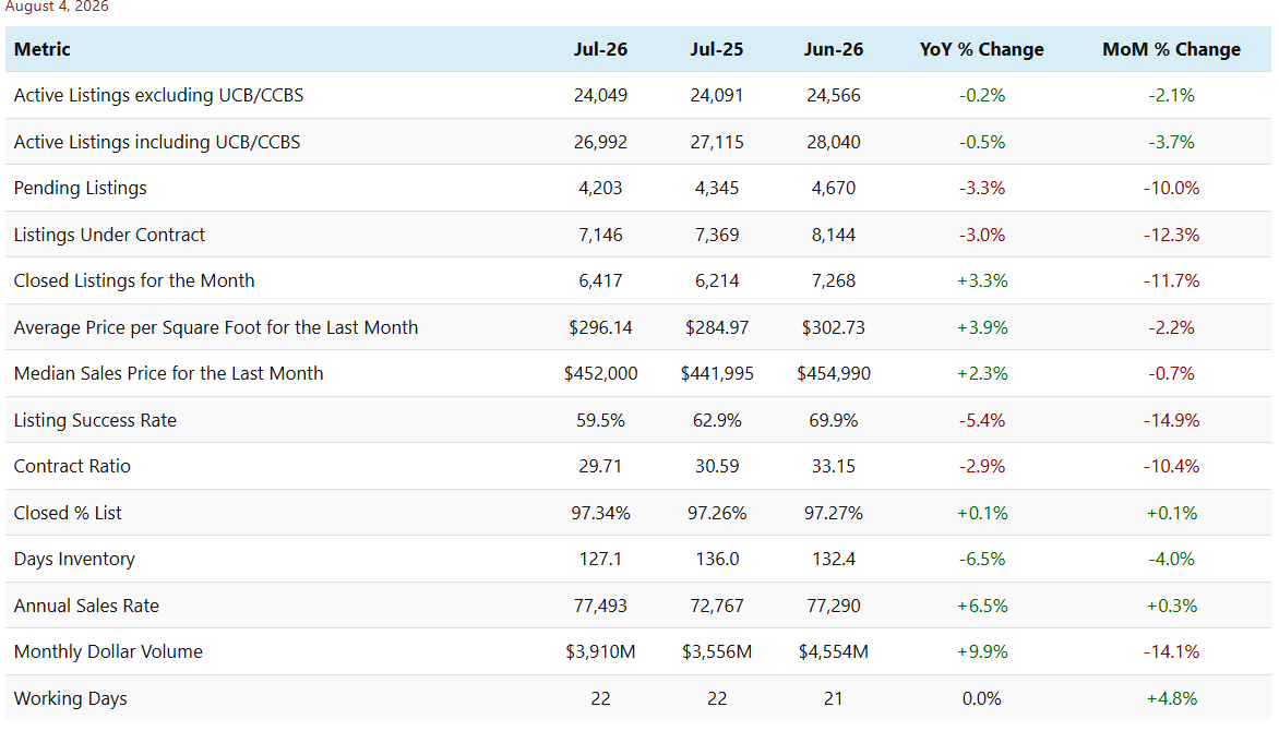
The market in early August presents a more mixed picture than we saw a month ago. Compared with July 2025, the completed numbers still look good — closed listings, average $/SF, median sales price, the annual sales rate and monthly dollar volume are all higher. But the forward-looking measures have turned: listings under contract, pending listings and the contract ratio are all below where they stood a year ago. That is a change from last month, when every metric on this table compared favorably with a year earlier, and it deserves attention.
Supply continues to drift lower. Active listings excluding UCB and CCBS fell 2.1% over the month to 24,049 and are now marginally below the count of a year ago, while the measure including UCB and CCBS declined more steeply at 3.7%. Days of inventory eased to 127.1, down from 132.4 a month ago and 136.0 this time last year. The seasonal pattern is familiar: sellers who have not found a buyer through the hottest part of the summer tend to withdraw and wait for cooler weather and more active buyers in the fall. This effect is most significant in the luxury segment and in 55+ communities. The regular market in the low and lower mid-range is seeing a rise in inventory since last month. The fall in the listing success rate, from 69.9% to 59.5%, tells a negative story — a far larger share of sellers left the market during July without a sale.
Demand weakened over the month by rather more than the headline suggests. Closed listings fell 11.7% from June to July, but July had 22 working days against June’s 21. Adjusting for that, closings per working day were down closer to 16%. The comparison with July 2025 is cleaner, since both months had 22 working days, and on that basis closings are up 3.3%. The annual comparison therefore remains positive even though momentum through the summer has clearly slowed.
Pricing is holding up better than transaction counts. The average price per square foot slipped 2.2% over the month but remains 3.9% above July 2025, and the median sales price is down just 0.7% for the month while staying 2.3% higher than a year ago. Sellers are still achieving 97.34% of list price, fractionally better than both last month and last year, which suggests those who do transact are negotiating from a reasonable position. The overall picture is a market that is quiet and seasonally subdued rather than one under stress — but the weakness in pending and under-contract counts means we should not assume a strong autumn recovery. We anticipate prices getting weaker over the next 6 to 8 weeks, but a rebound is likely once the luxury market makes a bigger contribution to the mix from October onwards.
Cromford Market Snapshot - August 2, 2026
Case-Shiller Home Price Index – Adjusted for Inflation
August 1, 2026
We publish Case-Shiller Index numbers for 20 metro areas in a line chart that lets you compare the 20 cities. However, until now these have been the simple numbers published by S&P/Cotality. The chart has just been modified so you can see the effect of inflation on house prices in the same 20 cities.
The original data is called “nominal” and represents the initial values. The control at the bottom of the chart allows you to choose either the National Consumer Price Index or the Phoenix Metro Consumer Price Index and apply this to the Case-Shiller Home Price Index.
Below is the chart using the HPI numbers for Phoenix using the CPI for Phoenix.
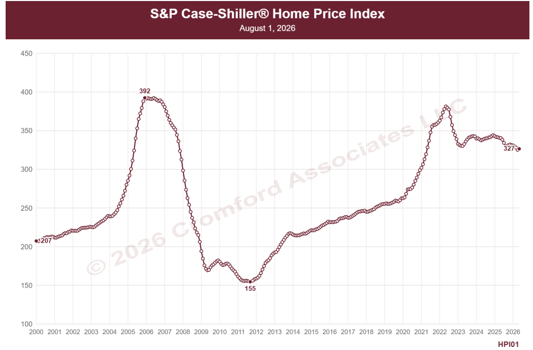
Adjusting for inflation increases index values for earlier dates because everything is converted to US dollars at their value in the most recent CPI release. This chart shows us that the peak of 2022 was not quite as extreme as 2006 and that homes are now 14% less expensive than they were in May 2022 and 17% less expensive than they were in December 2005.
It also shows that home prices adjusted for inflation have been falling slowly over the last 2 years. This is consistent with the Cromford Market Index being less than 90 for most of that period.
Among the other 19 cities, you will find many differing patterns for price behavior, so I encourage you to try the chart out for yourself. Atlanta, Boston, and Charlotte are the only metros among the 20 where it is reasonably valid to claim that homes are the most expensive they have ever been.
July 2026
CMI Large City Ranking Table - July 31, 2026
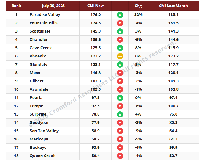
The average CMI is up 0.3% from last month. This is more favorable for sellers than last week, but not by much. The market lacks direction but there is a very clear distinction between the top and the bottom. The most expensive areas are getting easier for sellers while the least expensive are getting easier for buyers.
The number of cities moving in a direction favorable to buyers is eleven, one less than last week. We have only six moving in a direction that is favorable to sellers, while Phoenix is stationary. Among these, Paradise Valley stands out for sellers with an exceptional +32%, with Cave Creek and Glendale far behind at +8% and +5%. Paradise Valley has now overtaken Fountain Hills to claim the top spot.
In the other direction, the Southeast Valley is the main region moving in favor of buyers at the moment. San Tan Valley (-9%), Tempe (-8%), Chandler (-6%), and Maricopa (-5%) feature prominently in the list of 12 cities moving in this direction. Queen Creek only went down 4% but is stuck at the bottom of the table.
We once again have 8 cities in a seller’s market, 4 balanced, and 6 in a buyer’s market.
CMI Secondary City Ranking Table - July 30, 2026
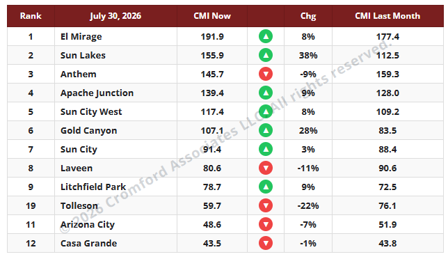
Over the last month, the secondary cities have done better for sellers than the major cities. Despite the overall buyer’s market, green up arrows outnumber the red down arrows by 7 to 5. There is much more movement in the CMI values for these smaller cities than for the large cities we monitor every day and report on once a week. The reason for the volatility is the same as for any statistical set with a small sample size. Fewer contracts, sales, and listings mean each individual event has a larger impact.
We see a huge improvement in Gold Canyon and Sun Lakes (again) in favor of sellers over the last 4 weeks, while Tolleson has again seen a large move in favor of buyers. Most other changes are relatively small.
The reason for the large improvement in Gold Canyon and Sun Lakes is the big drop in active listings in both these areas. Many sellers take their homes off the market for the summer, and those who are left face much less competition.
We have 5 cities in seller’s markets with their CMI over 110, with 5 in buyer’s markets with CMI under 90. The remaining 2 are in a balanced market between 90 and 110.
S&P/Cotality Case-Shiller Indexes for July 2026
July 28, 2026
The latest S&P Cotality Case-Shiller® Home Price Index® numbers were published today.
The new report covers home sales from March to May 2026. This means the typical home sale closed in mid-April, more than 3 months ago. We should remember that Case-Shiller data is based on older sales and does not include data from June 2026 onward.
Figures for Detroit were not made available again because data from the largest county in that area were not received in time. There were 18 cities showing rising prices, while San Diego was the only one to decline month-to-month. This time Phoenix returned to positive territory, so we were no longer the lone outlier we were in the previous report. The ignominy fell to our neighbors in San Diego CA.
Comparing with the previous month’s series, we see the following changes:
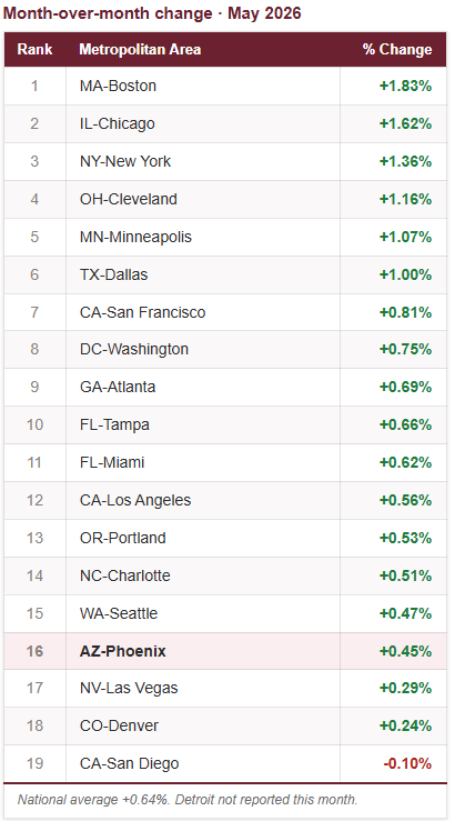
Phoenix is still an under-performer in the year-over-year table, and it remains in 15th place, the same as last month.
The average for the USA was +1.11%, so Phoenix is still well below that at -1.29%. When inflation is taken into account, 17 of the 19 cities have lower home prices than a year ago. Only Chicago at 6.93% and New York at 4.23% beat the latest inflation reading of 3.5%.
CMI Large City Ranking Table - July 23, 2026
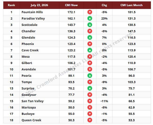
The average CMI is down 0.8% from last month. This is marginally less favorable for buyers than last week. The market just does not seem to be able to make up its mind which direction to head. Supply has stabilized but is still drifting down slightly, while demand remains weak but has stopped getting worse. This does not add up to a perceptible change in the market as a whole, though several sub-markets are changing to a greater degree.
The number of cities moving in a direction favorable to buyers is twelve, one more than last week. We have only six moving in a direction that is favorable to sellers. Among these, Paradise Valley stands out for sellers with an exceptional +23%, with Cave Creek and Glendale far behind at +8% and +7%. In the other direction, the Southeast Valley is the main region moving in favor of buyers at the moment. San Tan Valley (-11%), Tempe (-8%), Chandler (-8%), and Maricopa (-8%) feature prominently in the list of 12 cities moving in this direction.
We once again have 8 cities in a seller’s market, 4 balanced, and 6 in a buyer’s market.
Cromford Market Snapshot - July 27, 2026
Most Homes Are Not Getting More Expensive
July 22, 2026
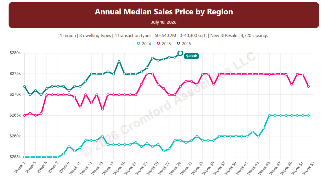
If we look at the annual median sales price across Greater Phoenix, we can see that it has been close to $450,000 for a very long time. However, it just reached a high of $454,000 on July 18, suggesting that homes are getting slightly more expensive. This is because the chart (and most people) ignore the falling buying power of the US currency. Doing otherwise can make you miserable and worried.
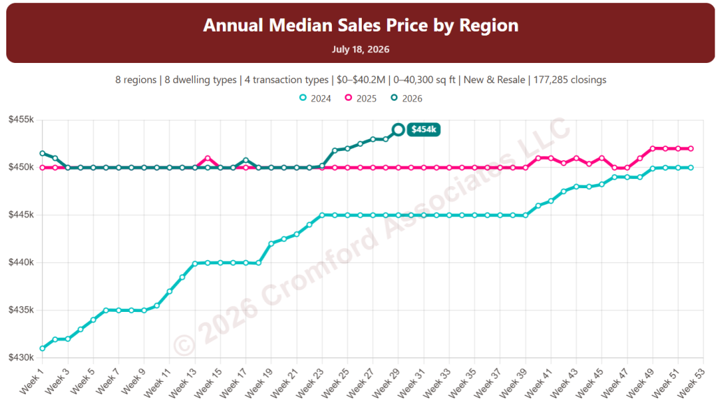
I fearlessly converted the nominal dollars in the chart to inflation-adjusted dollars, based on the Phoenix Consumer Price Index, with June 2026 as the base reading.
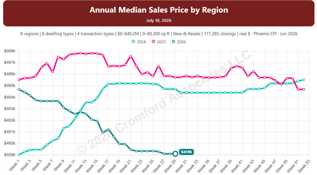
This puts the price into more realistic context. The typical home is cheaper now than at any time since the beginning of 2024, after adjusting for inflation. This chart represents a combination of all dwelling types, all price ranges, and all home sizes across Greater Phoenix. Things can look very different if you look at smaller segments of the market. Here is one example among many:
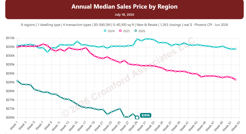
The chart above is for Gemini / Twin homes only. They tend to be a lot cheaper than single-family detached homes and are primarily concentrated in less expensive parts of the West Valley. As such, they have come down hard in price when adjusted for inflation, almost 14% cheaper than at the start of 2024.
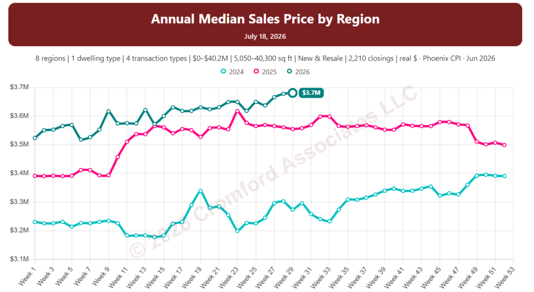
You probably guessed which homes have actually become more expensive – single-family detached homes over 5,000 square feet are in the above chart, and even allowing for inflation, they are up to a median of $3.7M, with a much lower price of $3.2M at the start of 2024.
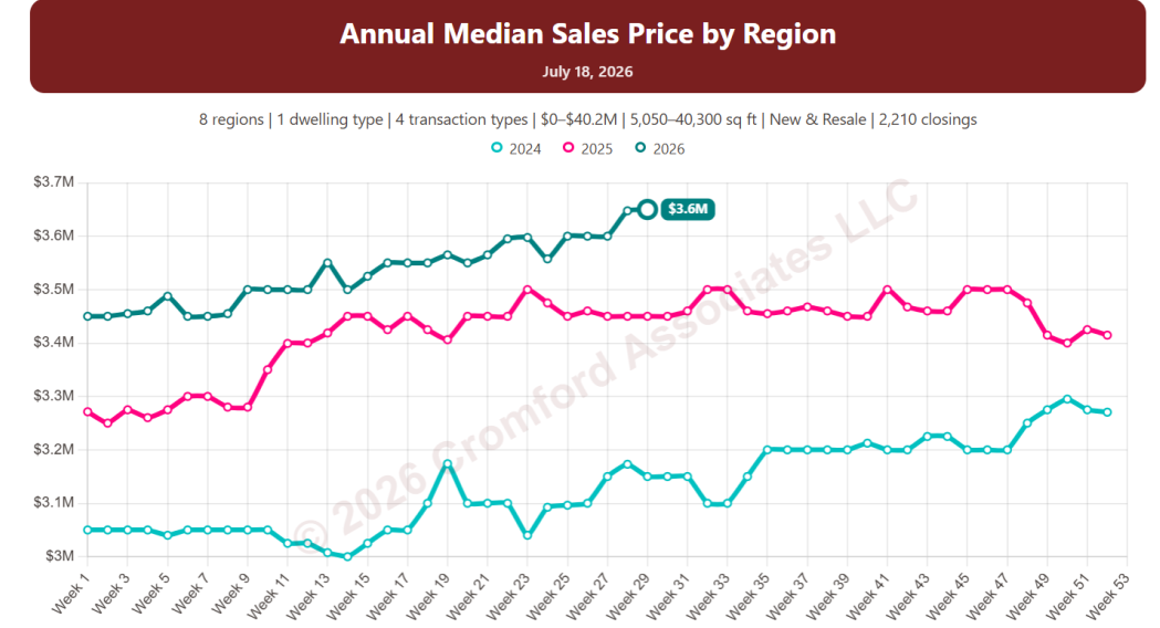
Taking out the inflation adjustment, we see nominal prices for these high-end homes are up 18% since the beginning of 2024. This is a completely different trajectory than for smaller and less expensive homes.
In most sectors, homes are cheaper relative to earnings and other things you might buy. However, large, expensive homes, especially in the Northeast Valley, have continued to rise in price even faster than inflation.
If you are wondering where these charts come from, they are extracted from the new website that we are preparing for launch later this year. They are not yet available for general use, as they are undergoing extensive testing, but if you are interested in becoming an early tester of the new site, drop me an email. In exchange for helping us with the testing, you will get early views of the new website’s features.
Incidentally, the new website will cover the whole of Arizona, although our data feed still comes from ARMLS rather than all the other Multiple Listing Services. Locations like Sedona / Verde Valley and Southeast Arizona have now joined ARMLS, and their data is available to us and will be shown in full on the new website when it launches. Our intent is to gradually expand Cromford Public to include county records from the other 13 counties, not just Maricopa and Pinal, but this will take longer because a lot of work needs to be done on data cleanup.
As a teaser, here is the same chart with the filter set for Southeast Arizona only:
Cromford Daily Market Snapshot - July 17, 2026
CMI Large City Ranking - July 16, 2026
-
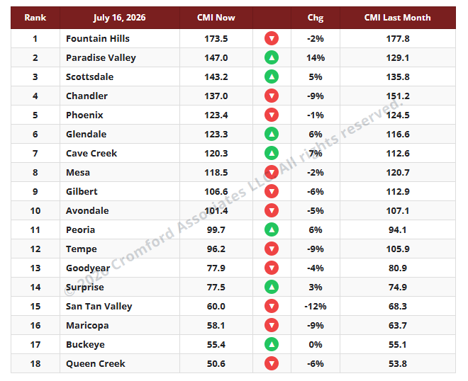
The average CMI is down 1.3% from last month. This is the same monthly change we measured last week, showing a small deterioration in the situation for sellers. Supply has stabilized and is no longer coming down, but demand continues to slowly weaken. Both changes mean there is little change being felt in the market from this time last month.
The number of cities moving in a direction favorable to buyers is eleven, one more than last week. We have seven moving in a direction that is favorable to sellers. Paradise Valley has improved the most for sellers (+14%), with Cave Creek a distant second at +7%. In the other direction, Tempe is still showing a significant move in favor of buyers at -9%, but has been overtaken by San Tan Valley (-12%) and is rivaled by Chandler also at -9%. The Southeast Valley is still looking weak relative to the rest of Greater Phoenix, with the Northeast Valley and the Northwest Valley holding up better.
We once again have 8 cities in a seller’s market, 4 balanced, and 6 in a buyer’s market.
-
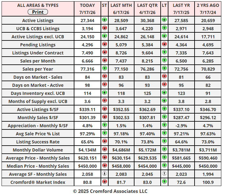
For the monthly period ending July 15, we are currently recording a sales $/SF of $304.32, averaged across all areas and types in the ARMLS database. This is up 0.4% from the $301.22 we now measure for June 15. Our forecast range midpoint was $307.78, so this month we got the direction right but overestimated its size. We were high, by 1.1%. The median sales price has remained stable. The monthly median price currently stands at $451,000, down from $457,500 last month but up from $445,990 a year ago.
On July 15, the pending listings for all areas and types show an average list $/SF of $317.91, down 1.3% from the June 15 reading. This suggests that closed prices are likely to fall again over the next month, though our outlook remains very uncertain, depending on how many ultra-luxury homes close escrow. This would be more normal than last month’s increase because, seasonally, we usually see prices dip during the third quarter. Among the pending listings, we have 96.1% normal, 1.7% in REOs, and 2.3% in pre-foreclosures (including a very small number of short sales). The level of distress is higher than last month and, though it remains low compared to the average over the last 25 years, we are seeing a distinct upward trend in pre-foreclosure activity and a rise in lender-owned listings.
Our midpoint forecast for the average monthly sales $/SF on August 15 is $300.36, down 1.3% from the July 15 reading. We have 90% confidence that it will fall within ± 2% of this midpoint, i.e., in the range $294.35 to $306.37.
The 21st Century Road to Housing Act
-
July 11, 2026
After some important changes, the Senate and Congress, with both Republicans and Democrats, have agreed on the content of an act to reform how housing is governed in the USA. Despite the President not signing it, the Act will become law today (July 11).
To someone following the housing market, what was left out of the act is probably more significant than what went in.
no ban on build-to-rent developments
no requirement for institutional investors to sell their existing properties
no ban on institutional investors buying new builds
no forced sale of build-to-rent properties after 7 years
no ban on institutional investors buying and selling to each other
under some circumstances, institutions are still permitted to buy to renovate and rent
institutions can buy resale homes if they have established rent-to-own schemes for residents
All of these provisions are different from what was initially proposed in at least one version of the legislation.
Since institutions stopped buying resale homes long ago, the prohibition (with loopholes) has almost no practical effect on the Arizona market.
If the act had been enacted as originally proposed, it could have forced institutional investors to quickly dispose of their properties. A few have been doing this of their own free will, but a forced liquidation in a short timescale would have had a similar effect to a new wave of foreclosures, delivering additional and excessive inventory at the lower end of the market.
This is not going to happen now.
Most of the remaining provisions of the act are intended to encourage planning to develop more housing at the affordable end of the market. However, this will be a slow, steady process, and the effect on the market will be similarly gradual and gentle. Don’t expect any major changes in supply.
Cromford Daily Market Snapshot - July 12, 2026
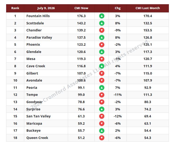
CMI Large City Ranking - July 9, 2026
-
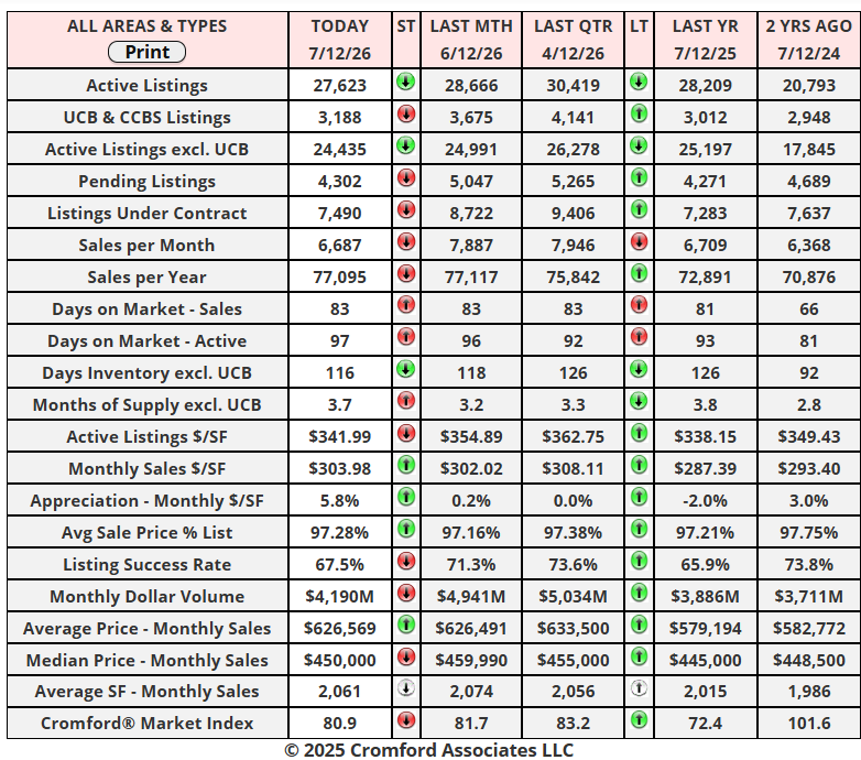
The average CMI is down 1.3% from last month. This represents a small deterioration in the situation for sellers. Supply is coming down slowly, but demand is falling slightly faster. Both changes are barely detectable unless you peer into the numbers for a long time.
The number of cities moving in a direction favorable to buyers is ten, the same as last week. We have eight moving in a direction that is favorable to sellers. Scottsdale and Paradise Valley have improved the most for sellers (+8%), with Peoria just behind at +7%. In the other direction, Tempe is still showing a big move in favor of buyers at -11%, but has been overtaken by San Tan Valley (-12%). The Southeast Valley is looking weak relative to the rest of Greater Phoenix, with the Northeast and West holding up better.
We once again have 8 cities in a seller’s market, 4 balanced, and 6 in a buyer’s market.
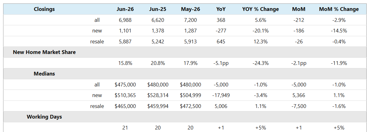
Maricopa Affidavit Stats for June 2026
-
June 2026 had 21 working days, one more than June 2025 and May 2026. This means it would be fair to expect 5% more closings than for both the month-over-month and year-over-year comparisons. The resale closings far exceeded that target, up 12.3% year-over-year, but new home sales were very weak, down more than 20%. The combined result was +5.6%, just squeaking past the target and a cause for relief and mild celebration. The month-over-month closings were not so impressive, with all metrics down despite June’s 5% advantage over May.
New home sales have once again underwhelmed and not by a small margin. Having favored new homes in 2024 and 2025, buyers have been shifting strongly toward re-sales in 2026.
The overall median sales price is slightly down from last year and last month, by only 1%, so we can regard this as flat in nominal terms. However, when we account for inflation, homes have become significantly more affordable relative to median earnings. Once again, new homes are under-performing in this respect, down 3.4% year-over-year while re-sales managed a small 1.1% increase.
New homes accounted for 15.8% of the Maricopa County market in June, down from 20.8% this time last year. That is a 5.1 percentage-point decline, meaning new homes have lost more than 24% of their market share since last year.
-
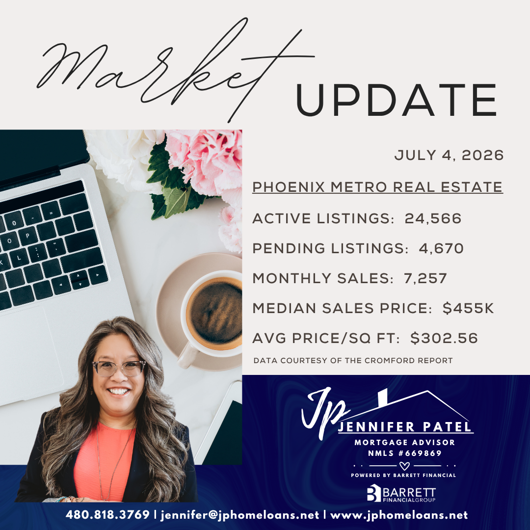
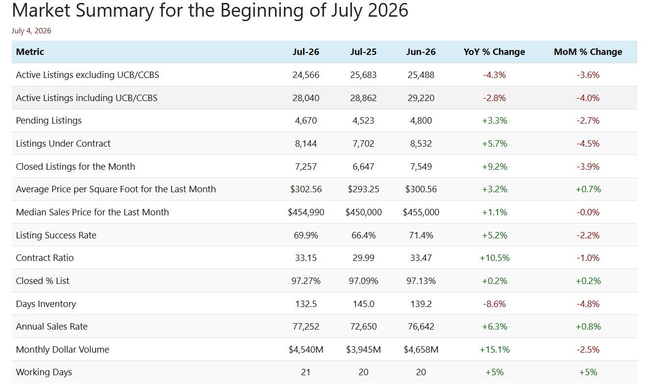
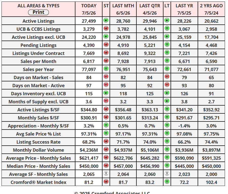
07.04 - The market situation in early July is clearly better than it was in July 2025 across all the above metrics, but is more mixed when comparing with last month (June). On the positive side, we have a slightly higher % of list achieved than a month ago, and inventory and supply measures are lower (a good thing for sellers). The annual sales rate also continues its slow recovery, and pricing looks slightly stronger when measured by average $/SF, though it flatlines when measured by the median sales price.
Supply is dropping slowly, and we now have fewer active listings than last month and this time last year. This helps sellers because they have less competition. Supply has dropped by a larger percentage at higher price points, as some luxury home sellers don’t show their homes during the hottest months of the year and wait until late September to relist.
Demand has fallen since last month, in line with normal seasonal patterns, but it remains better than at this time last year. Closed listings are up more than 9% year-over-year, but we can attribute 5% of that to June 2026 having an extra working day. Still a good result though under difficult circumstances.
Overall, the market is well-behaved and stable, in better shape than last year but still unexciting compared with what most market participants would like to see. There is no sign of significant price declines in nominal dollars, though inflation returning to over 4% means that, in real terms, homes have become significantly more affordable over the last several years.
Cromford Market Snapshot - July 5, 2026
Monthly Home Sales Stats
-
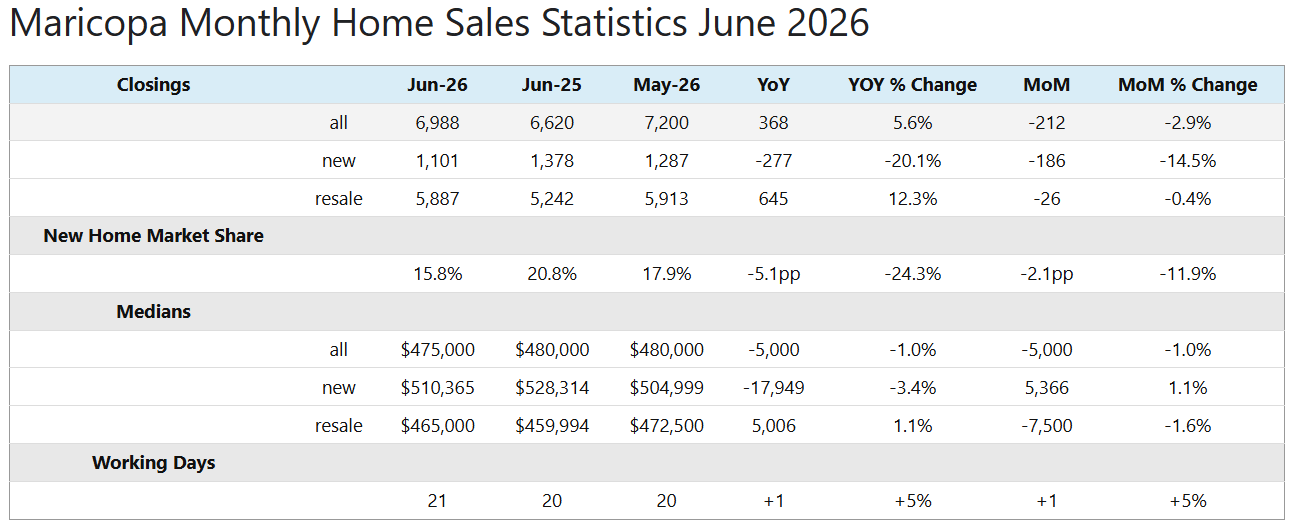
07.04- June 2026 had 21 working days, one more than June 2025 and May 2026. This means it would be fair to expect 5% more closings than for both the month-over-month and year-over-year comparisons. The resale closings far exceeded that target, up 12.3% year-over-year, but new home sales were very weak, down more than 20%. The combined result was +5.6%, just squeaking past the target and a cause for relief and mild celebration. The month-over-month closings were not so impressive, with all metrics down despite June’s 5% advantage over May.
New home sales have once again underwhelmed and not by a small margin. Having favored new homes in 2024 and 2025, buyers have been shifting strongly toward re-sales in 2026.
The overall median sales price is slightly down from last year and last month, by only 1%, so we can regard this as flat in nominal terms. However, when we account for inflation, homes have become significantly more affordable relative to median earnings. Once again, new homes are under-performing in this respect, down 3.4% year-over-year while re-sales managed a small 1.1% increase.
New homes accounted for 15.8% of the Maricopa County market in June, down from 20.8% this time last year. That is a 5.1 percentage-point decline, meaning new homes have lost more than 24% of their market share since last year.
Cromford Market Index - July 2, 2026
Single-famiiy markets in the 18 largest cities.
-
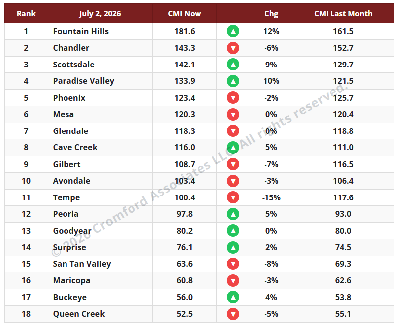
The average CMI is unchanged over the last month. While individual cities have risen or fallen, there is very little of interest I can tell you, as the average change is 0.0%. In general, supply has fallen, but a similar drop in demand has offset this. In the more expensive areas, supply has dropped significantly as listings expire for the summer months. These areas look better for sellers because they have less competition, not because there are more buyers.
For sellers, it is a little worse than last week, when we saw a 1% increase in the average CMI, the same percentage that we measured the week before. I guess that is good news for buyers, but only just.
The number of cities moving in a direction favorable to buyers is ten, three more than last week. We have eight moving in a direction that is favorable to sellers. Once again, Fountain Hills and Paradise Valley have improved substantially for sellers, while Scottsdale is up by 9%. In the other direction, Tempe is still showing big moves in favor of buyers. The Southeast Valley, in general, is looking less good for sellers and better for buyers; the best city for sellers is Mesa, with a slight change from 120.4 to 120.3.
We now have 8 cities in a seller’s market, 4 balanced, and 6 in a buyer’s market.
June 2026 - Infographic
-
Greater Phoenix Income is Rising
The Summer Season Is Upon Us
-
Incomes have been continuing to rise in our state. According to the most recent release from the Bureau of Economic Analysis, Arizona ranked 7th in the nation for nominal personal income growth at 4.3% and Arizona’s net earnings from work rose 5.7%. Both measures are well above the rate of inflation. Combined with home values remaining nearly unchanged year-over-year and mortgage rates holding near 6.6% over the past month, this suggests housing affordability is gradually improving.
Home values have been mostly flat for the past two years, and the median is still down 4.8% from the peak price of $480,000 recorded June 2022. However, homes below $500K have drifted down 4-5% during the same time frame while those between $500K-$1M have remained stable with little fluctuation. Meanwhile, homes over $1M surpassed 2022 a long time ago and are still on the rise in value.
The past 4.5 years have included a sharp price spike in 2021, followed by a correction in 2022 and very little appreciation from 2024 through 2026 for most homeowners. However, the likelihood that the next 5 years will follow the same trend is low. Purchasing in a buyer’s market is usually best for those who plan to own their home for at least 5 years in order to ride out cycles like this one, which turned towards a buyer’s advantage in November 2024.
There are advantages and disadvantages for buyers in today’s market. A major advantage is a lack of the frantic buyer urgency that was experienced in 2021, fueled by low supply and rapid population growth. Back then, buyers often only had a few minutes to tour a home, then felt pressured to waive appraisal and inspection contingencies as multiple offers flowed in. Asking for repairs was out of the question and 61% of sales were over asking price. Today, most homes are on the market for more than a month before landing a contract. Reduced buyer competition has made negotiations less stressful for buyers and increased seller willingness to offer repairs and closing-cost assistance. This can include a temporary mortgage rate buydown and cost the seller about $10,000. This level of seller aid was unheard of prior to 2023.
The disadvantage to buying in today’s buyer’s market is that home values tend to have low appreciation, no appreciation, or negative appreciation. Buyers typically like to purchase a home and watch it appreciate in value, but buyer’s markets can put a homeowner’s patience to the test. Those who purchase in this market should generally expect to own the home for at least 3-5 years to ride out the cycle. During that time, if a homeowner significantly improves the property it will improve their chances of building equity sooner.
While appreciation has been limited recently, buyers who hold their homes through a full market cycle can still build substantial wealth through a combination of appreciation and mortgage principal reduction. If the housing market pulls out of its slump over the next 5 years to average a mild 3% appreciation per year, a buyer who bought a median-priced home around $450,000 with 10% down could build equity faster than they might expect. After 5 years of just appreciating around the rate of inflation, there would be over $72,000 in appreciation, plus another $25,500 in equity from making the principal payments. Including the original down payment, that would amount to approximately $142,500 in total equity while enjoying the benefits of homeownership. This is why homeownership is often referred to as a “forced savings account”.
Commentary written by Tina Tamboer, Senior Housing Analyst with The Cromford Report
©2026 Cromford Associates LLC and Tamboer Consulting LLC -
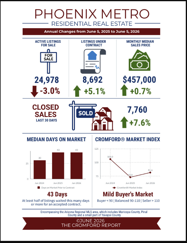
Buyer demand is up despite higher mortgage rates as listings under contract are up 5.1% and closed sales are up 7.6%. This year’s buyer’s market, while not ideal, is an improvement over last year. There is evidence of pent up demand that is often revealed once mortgage rates push below 6.5% and increases when it’s closer to 6.0%.
However, Greater Phoenix is now entering into its summer season. This comes with hotter weather, and a few holiday speed bumps starting with Memorial Day week. Whenever there is a 4-day work week buyer contract activity takes a dip, and this Memorial Day was no different, dropping 21% over the course of 2 weeks. Then, just as activity begins to recover, the market encounters the Fourth of July holiday week, followed by Labor Day.
Many sellers have decided to wait it out. New listings are added at the 2nd lowest rate seen since 2000, the fewest new listings were added in 2023 and 2026 looks like it will be in second place. Meanwhile, cancelled listings are up seasonally, but down year-over-year, which is also contributing to a decline in supply.
What to watch: Last year mortgage rates fell from 6.6% to 6.1% from August to September. That resulted in a spike of buyer contracts until Labor Day week hit and contract activity cooled. If that happens again this summer, sellers could see a better boost in buyer demand.
Commentary written by Tina Tamboer, Senior Housing Analyst with The Cromford Report
©2026 Cromford Associates LLC and Tamboer Consulting LLC
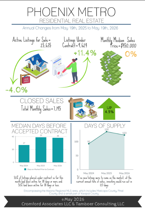
May 2026 - Infographic
-
Conflicting Headlines: Is Supply Too High or Too Low?
Listings Under Contract Increase 11% in May
-
Two local headlines published this month contradicted each other regarding the active supply situation in Greater Phoenix. The first, published on May 4, was titled “Phoenix housing inventory surges toward record highs.” The associated article stated the current active listing count is “a level only surpassed in two months in recorded history: April and May of last year.” This statement aligns with the last 12 years of historical data, but it doesn’t hold up to 25 years. Today’s inventory count is surpassed by every count recorded daily from 2006-2010. The highest count ever recorded by The Cromford Report is November 2007, where supply peaked at nearly 58,000 active listings before prices collapsed in the infamous 2008 Great Recession, resulting in the largest foreclosure crisis ever experienced. Today’s inventory counts are not remotely comparable to that time in history.
The second headline, published 10 days later on May 14, was titled “Arizona facing home shortage as unaffordability weighs on potential buyers” and declared that Arizona faces an immediate shortage of 56,000 homes, with a long-term shortage of 110,000. So which headline is correct? Is inventory surging to new highs or is it critically low? Surging inventory would put downward pressure on prices while an inventory shortage results in upward pressure. Looking at median sales price measures, they have had little fluctuation for more than two years, suggesting that neither of these theories is reflected in pricing trends.
In short, Greater Phoenix supply counts are not breaking records, they are not surging, and they are not critically low. Statistically, active supply is considered within normal range and stable for now. Meanwhile, buyer contracts have improved 11% over this time last year despite recent mortgage rate increases, indicating that buyer demand could increase significantly should economic certainty improve and mortgage rates fall closer to 6.0%.
Commentary written by Tina Tamboer, Senior Housing Analyst with The Cromford Report
©2026 Cromford Associates LLC and Tamboer Consulting LLC -
The peak spring buying season is nearly over and total sales to date have exceeded last year by 2.9%. The largest improvement is in the luxury market where sales over $1M are up 10% and at a record high. Most impressively, sales over $5M are up 31% over last year and there have been 36 sales over $10M so far, already exceeding last year’s annual record of 32 before the year is halfway through.
As temperatures rise over 100 degrees in May and June, the luxury market typically sees a large spike in cancelled and expired listings. Ironically, this can cause supply to drop more than summer demand and put these areas in a short-term seller’s market. This exact scenario happened last year where Paradise Valley flipped from a balanced market in May to the #1 seller’s market by August due to record listing cancellations, then returned to a balanced market after new listings returned in September and October. While May isn’t over yet, a high level of April cancellations over $1M has already caused supply to drop early, which could be good news for those who choose to stay active over the summer
As for the rest of the sellers, it’s business as usual as buyers are still in the driver’s seat. Mortgage rates are back to 6.65%, which has the potential to stall buyer activity until it drops back below 6.5%. Home condition matters, seller incentives matter, and pricing matters. Expect marketing times to increase by approximately 6-10 days over the next 2-3 months.
Commentary written by Tina Tamboer, Senior Housing Analyst with The Cromford Report
©2026 Cromford Associates LLC and Tamboer Consulting LLC
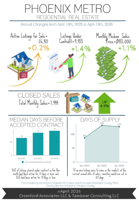
April 2026 - Infographic
-
Single Family Home Prices Remain Stable Year-Over-Year
Rates Decline Again in April
-
March was an eventful month as rates spiked from 5.99% to 6.64% per Mortgage News Daily. The spike was a direct response to uncertainty over the Iran war and its affect on U.S. inflation. Once the unemployment report was released showing an improvement from 4.4% to 4.3%, rates began drifting back down. By the time the CPI inflation was released at 3.3%, up from 2.4%, it had already been priced into the rates so there was little effect. As of mid-April, rates were back to 6.3% and trending down.
The effect of the rate disruption was a decline in buyer contract activity, in March they were up 10% and in April up just 1%. Contracts could begin to return as rates fall below 6.25%. The lesson buyers have learned over the past 3 years of volatile mortgage rates is patience. Rates have a recent history of knee-jerk spikes in times of unexpected uncertainty (i.e. tariffs, trade through the Strait of Hormuz), and declines after the shock wears off.
The increase in supply seen in January and February stalled in March and now in April as well. In February supply was up 9% over last year. In March supply was only up 4.8% and in April it is barely up 0.2% thus far. With both contract and listing activity stalled, they have cancelled each other out, thus maintaining the status quo for home prices.
While the conflict with Iran is not settled, the markets are responding as if they expect it to be a short-term influence on inflation. If that proves to be true, then there will be little impact on home values as they typically take 3-6 months to respond to a prolonged disturbance in the force. Since September 2022, the median mortgage rate is 6.89%. This puts the current 6.3% mortgage rate well on the low side of the last 3.5 years.
Commentary written by Tina Tamboer, Senior Housing Analyst with The Cromford Report
©2026 Cromford Associates LLC and Tamboer Consulting LLC -
Sellers have the least advantage in the condominium market under $300K as supply is up 20% over last year and contracts in escrow up only 13%. April sold prices are down 9.5% from last year in this segment with the median size sold at 1,048sqft, historically prices for this segment are similar to where they were 5 years ago around May 2021. Conversely, Single family homes between 1,200-2,400sqft have shown the most stability in prices over the past 3 years with minimal fluctuation.
The median sized single family home sold in Greater Phoenix this year is 2,003sqft, which is 318sqft bigger than 2001’s median of 1,685sqft, 25 years ago. Typical home sizes vary based on city, which is reflected in their median sales prices. For example the 2026 median sized home sold in the city of Phoenix is 1,798sqft and the median price is $482K. Compare that to a newer cities like Chandler where the median size is 2,061sqft at $558K and Queen Creek at 2,659sqft and $688K. Below are the median sales prices by year for the following single family size ranges in Greater Phoenix. They show that while the Valley has endured a buyer’s market since November 2024, price trends are within 1% of last year’s prices for the majority of common-sized homes:
Commentary written by Tina Tamboer, Senior Housing Analyst with The Cromford Report
©2026 Cromford Associates LLC and Tamboer Consulting LLC
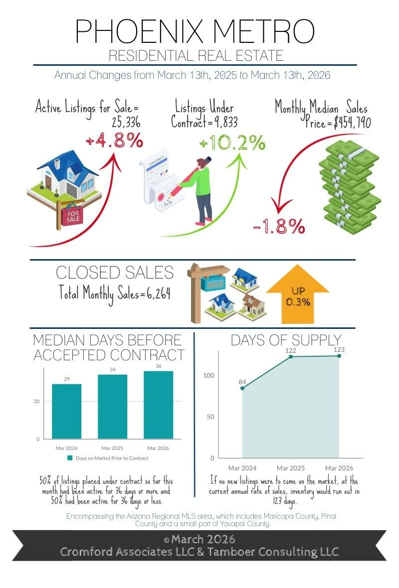
March 2026 - Infographic
-
Listings Under Contract Now Up 10% Over Last Year
Fewer New Listings Entering Market, Supply Stabilizing
-
It’s been a busy month in the housing market! Contracts in escrow are now up 10.2% over last year and are outperforming even 2023 and 2024 at this juncture. Influencing this increase in demand have been mortgage rates stabilizing below 6.2% since Christmas and even hitting 5.99% in the last week of February. While the Cromford® Demand Index shows the Phoenix market is 13% below normal, that’s an improvement from 16% below normal last month, and 24% below normal measured in August last year.
New listings have notably dropped off, however, as some sellers wait for better days to list their homes. While newly active counts in January were in line with last year, both February and March-to-date are down 7%. With fewer new listings replenishing those that have gone under contract, cancelled, or expired, the overall supply count has stopped rising. Last month inventory was up 9% over last year, now it’s dropped to 5%, and at this rate it could be below last year by next month.
While buyer demand for homes has been recovering, the recent war with Iran that started on February 28th has created some speed bumps along the way. Hopes are high that the effects are temporary, but the rising cost of gas threatens to affect the current rate of inflation in the United States. Mortgage rates do not like inflation, and in response they have risen from 5.99% to as high as 6.4% as of this writing. This increase in mortgage rate gives buyers two choices, to accept a 5% increase in payment, or a 5% drop in purchasing power.
The effect on the market could be a lag in contract activity as buyers wait to see if mortgage rates drift down again. If and when they do, then a surge of new contracts could follow. Rumors of increased tax refunds may also provide a welcome boost to the April season.
Commentary written by Tina Tamboer, Senior Housing Analyst with The Cromford Report. ©2026 Cromford Associates LLC and Tamboer Consulting LLC
-
Monthly closings so far are holding close to last year’s count, but current contract activity suggests that will improve over the next 4-6 weeks. The condo/townhome market is finally seeing some improvement. After starting off slow, condos under contract finally pulled ahead of last year by 1.3%. While this is welcome news, unfortunately it remains a tough market for condo sellers as inventory is 11% higher and sales prices continue to decline. This is especially true in small condos under 1,100 sq ft that are competing with newly built apartment complexes offering big incentives and lower rents to attract tenants. These small units have seen an accumulated price decline of nearly 17% since the peak of June 2022, which erases most appreciation achieved after mid-2021. Condos and townhomes larger than 1,100 sq ft have fared much better than the smaller units, but still have a tougher time than single family homes competing within the same price points.
Within the single family market, certain areas are hotter than others when looking at the ratio between what’s active vs. what’s under contract. Specifically, the zip codes surrounding the intersection of the 101 and I-17 in the North Valley. This area includes North Glendale, Moon Valley, and Desert Ridge. Other noteworthy areas with favorable demand for single family sellers are Maryvale, Tolleson and Laveen in the West Valley, and in the Southeast Valley South Tempe, Chandler, West Mesa and the I 60 corridor to Apache Junction.
For single family properties under $400K, the entire West Valley lights up hot with many zip codes showing a frenzy with more homes under contract than active for sale. Increasing the price range to $400K-$500K, then the entire Southeast Valley lights up with hot and frenzy activity. As the price rises to $600K-$800K, the entire north side of the 101 lights up with activity spanning Norterra, Moon Valley, Desert Ridge, Cave Creek, and North Scottsdale. The purpose to this story is to illustrate that one price point may be a frenzy in one area, cold in another, and balanced everywhere else.
The luxury market in particular has had an extraordinary season thus far. Specifically, sales over $3M are up 26% year to date, aided by a whopping 26 ultra-luxury sales over $10M. The biggest year for sales over $10M was 2025 with 32 sales. That was for the entire year. 2026 has already achieved 81% of 2025’s annual sales count before the first quarter is complete. There are currently 102 active properties for sale over $10M in the Arizona Regional MLS.
The message for sellers continues to be patience. The housing market is in recovery, but it’s a slow one.
Commentary written by Tina Tamboer, Senior Housing Analyst with The Cromford Report. ©2026 Cromford Associates LLC and Tamboer Consulting LLC
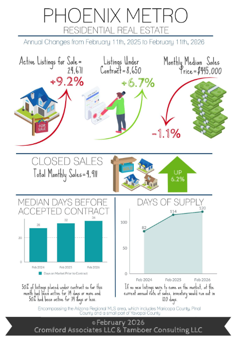
February 2026 - Infographic
-
Contracts in Escrow up 7% Over Last Year
The Market is Better, but It’s Not Easy for Sellers
-
The home buying season is entering its busiest time in Arizona, and so far contracts in escrow are 7% higher than this time last year and they’re expected to peak over the next 2-3 months. Currently, demand is considered 16% below normal for this time of year, but last August it was 24% below normal so conditions have improved since rates dropped to the low 6% last September.
The current level of inventory for sale is considered normal for this time of year, which is a full recovery after 14 years of documented chronic under-supply in Greater Phoenix. Total inventory in the Arizona Regional MLS is up 9% over last year and combined with lower demand places the Valley in a slight buyer’s market overall, with large central cities in modest seller’s markets and growing cities on the outskirts in prolonged buyer’s markets.
Not all cities are below normal in demand. In fact, Apache Junction is 23% above normal for demand and normal for supply, ranking the city as the 4th strongest seller’s market for now. Many growing cities in buyer’s markets have normal levels of demand, but high supply. These cities include Buckeye, Gold Canyon, Goodyear, San Tan Valley, and Surprise, where annual sales have increased quickly over the past year as a growing number of buyers have taken advantage of attractive seller and builder incentives. Developers have responded by scaling back the number of permits to avoid prolonging the oversupply situation and encourage a more balanced market.
Bottom line, buyer demand is improving as conventional mortgage rates have remained stable in the low-6% range for nearly 6 months now; both FHA and ARMs are in the mid-5% range. Non-luxury home prices below $800K are down an average of 4% from last year. Every 0.1% drop in the mortgage rate is 1% off the principal and interest payment, and every 1% drop in price is another 1%, each equates to an extra $10 savings per $1,000 in payment. Combining the rate declines and price declines since this time last year, mortgage payments are down an average of 14% for median-priced homes, so a $2,500 payment quoted last year would be $350 less this year for the same home. For those buyers who are in a position to purchase a home, there is little advantage to delaying a purchase 3-6 months for prices or rates to decline further as it may only save an extra $30 or less per month in payment.
Commentary written by Tina Tamboer, Senior Housing Analyst with The Cromford Report
©2026 Cromford Associates LLC and Tamboer Consulting LLC -
It’s business as usual for sellers. Professional advice last year is the same advice this year, but the market has improved compared to last summer. While January is the top month for luxury and retirement community listings to enter the market, March is the top month for mainstream sellers. These new listings create a surge of inventory in preparation for the peak contract months from February through May. This wave typically results in existing sellers lowering their asking prices to compete. It’s a cycle that repeats every year.
It’s natural for sellers to introduce their listings with prices that test the boundaries of what the market can bear. When transitioning from a seller’s market to a buyer’s market, buyers will increasingly refuse to engage at these elevated prices, ghosting the sellers until they bring their asking price within a desirable range. After more than a year of this behavior, sellers have become more moderate in their expectations at the onset, resulting in a 4% decline in early price reductions compared to last year. Once the list price comes within 2-3% of where the buyers believe it should be, then sellers increase their probability of an offer.
Buyers have become quite finicky, however, and aligning your price with existing comparable properties may not be enough. Proper price positioning today should focus on being the biggest “bang for the buck” in the buyer’s eyes instead of getting an extra dollar for every extra amenity and upgrade one has put into the home. Condition is important, offering a clean property that has been well-maintained with newer systems and few expensive projects for a buyer, combined with a competitive price, will aid in landing an offer.
While it seems reasonable to simply discount a home due to condition, this approach often fails in a buyer’s market. The extra money, effort, and time to bring a property up to par is often more than a buyer is willing to shoulder when there are other properties that don’t require the hassle. Sometimes providing a quote and a contractor who can perform the work right away, or even prior to close of escrow, can go a long way in addressing these concerns. Also, be aware of any new home developments that may be competing within 1-2 miles of your listing and within your price range, even if they’re not comparable in size or location, your potential buyer will be using them as a benchmark for condition, value, and incentives.
Commentary written by Tina Tamboer, Senior Housing Analyst with The Cromford Report
©2026 Cromford Associates LLC and Tamboer Consulting LLCv
January 2026 - Infographic
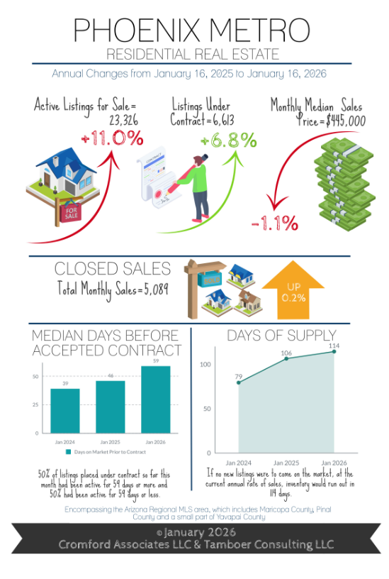
-
These Cities Had the Most Sales Growth in 20
Affordability Strains Show Signs of Easing
-
Happy New Year! Buying season has begun in Greater Phoenix, and it’s kicking off with a wave of fresh new listings. In a typical year, January is the most popular month for luxury and retirement community listings to hit the market while March tends to be the peak month for the main stream. Within the first 3-4 weeks of the year, these new listings are met with buyer demand escalating dramatically in January, then tapering off before peaking in April or May.
New listings are coming in weaker than this time last year, but only down 2.5%. That’s still stronger than the 5 years from 2020-2024 which had the weakest counts in 25 years for January listings. Listings under $300K are seeing a significant increase in new supply, up 15% over last year and with nearly 3,800 active listings at this writing, comprising 18% of supply. This is the most affordable range in Greater Phoenix where sales prices are down 2-3% from last year and are continuing to decline. It comprises mostly condos and mobile homes in central cities such as Phoenix and Mesa, and mostly single family homes in the outskirts like Pinal County. All other new listing counts are in line with last year or weaker, which is contributing to a more balanced state between supply and demand as we begin 2026.
A $300K purchase with FHA is approximately $1,860/month before taxes and possible HOA. Mortgage payments on properties under $300K can compete with rent, but not necessarily when tenants are upgrading their living space. For instance, a tenant paying $2,100 in apartment rent in Scottsdale cannot afford to upgrade to a single family home in the same area for the same monthly payment. However, they may be able to purchase a similar unit in the same area, or they could purchase a single family home in an outer city like Maricopa and commute.
This is where the affordable housing debate can get messy. Listing counts are telling us that the supply of affordable homes under $300K is rising and sales of those units are also rising (up 7%), suggesting that affordability strains are easing. However, 2025 sales over $500K were also up 7% while sales within $300K-$500K were near identical. If there were truly a lack of affordable homes, then supply under $300K would be rapidly declining like it did from 2020 to 2022 where there were fewer than 500 for sale, and prices would be rising. But that’s not happening. Evidence suggests that it’s not a lack of affordable homes to purchase, but an aversion to moving out of a desirable area.
*Per RL Brown Reports, a local specialist on new home construction data.
Commentary written by Tina Tamboer, Senior Housing Analyst with The Cromford Report
©2026 Cromford Associates LLC and Tamboer Consulting LLC -
2025 ended with total annual sales up 3.5%, equivalent to 2,351 more sales through the MLS than in 2024. Local builder reports* show new home sales down nearly 6% for the year and 2025 permits for new construction were down a significant 21%. Nationally, builder optimism is low for future sales, reportedly due to labor and lot shortages. However, some cities with a lot of builder activity saw sales shoot up the most in 2025.
By number of sales per the Maricopa County Recorder’s Office, the following cities saw the biggest jumps in closed sales last year: 1) Goodyear with 414 more sales, up 16%, median price $486K; 2) Scottsdale with 335 more sales, up 5%, median price $900K; 3) Peoria with 245 more sales, up 7%, median price $515K.
By percentage growth of sales, the following mid-sized cities saw the biggest proportional increases: 1) Waddell up 36% with 178 more sales, median price $468K; 2) Sun Lakes up 32% with 122 more sales, median price $470K; 3) Anthem up 29% with 64 more sales, median price $574K.
The 2025 annual median sales price for Greater Phoenix is $451K, but it’s interesting to note that half of the cities with sales growth had considerably higher median prices. Considering that most of 2025 operated with mortgage rates in the high-6% or low-7% range, entering 2026 with rates ranging in the high-5% and low-6% means payments are at least 10-12% lower on the same priced homes from a year ago. This bodes well for first quarter sales in Greater Phoenix in 2026.
While sales are expected to increase, prices are not. Price is the last measure to move when a market shifts, and it can take up to 3-6 months to emerge. Price appreciation remains stagnant in the middle price ranges, rising in upper ranges, and declining under $400K. Greater Phoenix is pulling out of a buyer’s market and edging towards a balanced state, but a seller’s market isn’t on the horizon.
*Per RL Brown Reports, a local specialist on new home construction data.
Commentary written by Tina Tamboer, Senior Housing Analyst with The Cromford Report
©2026 Cromford Associates LLC and Tamboer Consulting LLC
December 2025 - Infographic
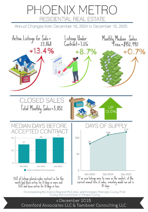
-
Optimism Emerges for 2026 Home Sales
Incomes Up 33% in Maricopa County since 2020
-
Journalists reporting on housing affordability are frequently quoting sources that reference median household income. Household income can be broken down into two categories, family and non-family households. The US Census defines a family household as two or more people living in a home and related by blood or marriage. Non-family households are all others, including non-related people living as roommates or people living alone. Non-family household income is typically much lower than family income and is more suited for measuring the affordability of rental housing. Family household income is more suited for measuring the affordability of purchasing a home.
From 2020-2024, the median annual household income in Maricopa County rose 33% from $68K to $91K. The non-family median household income rose from $44.5K to $59K. Family income rose from $80K to $108K; and married family income, a subset of family income, rose from $95K to $126K.
The lending industry considers 28% of gross income an affordable monthly payment for mortgage or rent. For a family household that’s roughly a $2,500-$3,000 payment. At a mortgage rate holding steady around 6.25%, that payment supports homes priced between $350,000 and $500,000 in Maricopa County. That budget will support roughly a 1,500-1,800 square foot single family home, which will trend in the mid-$300s in the West Valley, and the mid-$400s in the Southeast Valley.
Incomes are not stagnant in Maricopa County and have been rising at a significant pace since 2020. It’s home values that have been stagnant for 3 years waiting for family incomes to catch up and mortgage rates to decline. Inventory under $500K accounts for roughly 57% of all inventory for sale and is up 16% from last year. With rates holding steady in the low 6% range for the last 4 months, demand and optimism is up for the onset of 2026.
Commentary written by Tina Tamboer, Senior Housing Analyst with The Cromford Report
©2025 Cromford Associates LLC and Tamboer Consulting LLC -
November closings were another success for Q4 2025, up 3.3% from last November, except it was actually better than that. Last November had 19 closing days compared this November with 18 closing days, meaning this year November closed an extra 23 sales per day, putting the improvement at 9% instead of 3%. So far December is also outpacing last year with an extra 14 closings per day on average. If this is a peek into what 2026 may bring, then sellers should be optimistic for contract activity in January.
The big question is how many listings will line up to meet January’s expectation of increased demand. January is typically the top month for luxury, retirement and seasonal community listings to hit the market. However, new listings across all price points and areas often see a peak in March, providing ample selection for Spring buyers. This front-loading of inventory in the first part of the year often results in a rising number of price reductions as well, the level of which depends on whether we enter the year in a buyer’s market, balanced, or seller’s market.
Recent improvements in demand combined with declines in supply are pushing the Cromford Market Index back in the direction towards a balanced state. While Greater Phoenix is still in a buyer’s market overall, central and established cities are becoming the first to move back into seller’s markets. Most recently, Phoenix, Mesa and Tempe shifted back into seller’s markets within the last 30 days, putting nearly all cities in the Northeast and Southeast Valley in seller’s markets, with the exception of buyer’s markets Queen Creek and Sun Lakes. Developing cities on the edges of Metro Phoenix are typically the last ones to pull out of a buyer’s market. Pinal County cities, for example, are buyer’s markets except for Apache Junction, which is a seller’s market. The West Valley is a mix as El Mirage is a small seller’s market and Peoria recently shifted into a balanced market, joining Glendale, Avondale and Laveen. All other West Valley cities are buyer’s markets.
Don’t expect much upward pressure on price in the short term, even if your city has shifted back into a seller’s market. Prices can take up to 6 months to show a response to a shift, which means the seller’s market must be maintained, and many of these cities are still quite weak. What sellers can expect is more showing activity, shorter days on market, and less pressure to reduce their price once the Spring buying season begins.
Commentary written by Tina Tamboer, Senior Housing Analyst with The Cromford Report
©2025 Cromford Associates LLC and Tamboer Consulting LLC
November 2025 - Infographic
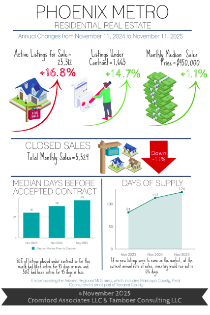
-
Best Q4 for Contract Activity in 3 Years for Greater Phoenix
First-Time Homebuyer Payments are Down 13%-15%
-
It’s been an exciting month of November since President Trump floated the idea of a 50-year mortgage to help some buyers qualify to purchase a home. The initial reactions from the industry have spurred a healthy discussion on its potential impact on borrowers, affordability, demand. Since then, multiple ideas are circulating for new products that bring down payments without extending the term of the loan. It could get interesting!
For context, on a $400,000 loan at 6.25%, the PI payment on a 30-year is $2,463 and on a 50-year is $2,180, a difference of $283/month or 11.5%. But the cost of that savings is a much slower repayment of the loan. For example, after 3 years of payments a borrower would have paid down their loan by roughly $15,000 on a 30-year mortgage, but only $3,800 on a 50-year mortgage. It would take 9-10 years of payments to pay down the same 50-year mortgage by $15,000. This can create issues when it comes to pulling out an equity loan for expensive maintenance items like a new A/C unit or remodeling projects within 10 years of homeownership. That puts a lot of importance on annual appreciation to build equity.
The good news for first-time home-buyers looking under $400,000 is Greater Phoenix price measures have come down 10-14% from the peak of 2022, and 3-5% in just the last year alone. At 6.25%, mortgage rates are down from their peak of 7.25% at the beginning of 2025, and 0.5% lower than rates from last July, which has reduced the PI payment by 5-10%. Lower prices combined with mortgage rates down a full 1% puts payments down 13-15% over the course of the last year. This does not include the extra 20% off in the first year provided by temporary buydowns paid for by 60-70% of sellers in this price range. Supply of properties under $300K is up 39% over last year, prices are down 5%, October sales increased 21%, and new contracts are up 32% so far in November.
According to the Bureau of Labor Statistics, US wage growth has been outpacing the rate of inflation for 2 years now. Over the past 2 years, Greater Phoenix average hourly earnings have grown 12% while the concurrent CPI inflation rate for the area shows prices have only risen 3.3%. This growth combined with home prices coming down in the most affordable price ranges mean that a 50-year mortgage may not be needed to bring affordability measures into a manageable range. They may already be there for a growing number of buyers.
Commentary written by Tina Tamboer, Senior Housing Analyst with The Cromford Report
©2025 Cromford Associates LLC and Tamboer Consulting LLC -
It took a while for the buyers to mobilize, but better late than never. So far, this is the best 4th quarter Greater Phoenix has seen in 3 years for contract activity. Listings under contract are up 15% over last year with notable improvements in the market under $300K and the market over $1M. The government shutdown didn’t help closings for FHA and VA transactions, especially between $300K-$600K, but October saw a 3.3% increase in sales regardless, and closings delayed will add to the November sales counts.
The Federal Reserve met on October 29th and announced a 0.25% decrease in the Federal Funds Rate and the end of the reduction of their securities holdings as of December 1st. This is one more step towards easing up on quantitative tightening and should be stabilizing for future mortgage rates. That is good news for sellers.
In the meantime, stock market performance, corporate profits, and cryptocurrency have performed well enough to boost the luxury market in Q4. Contracts in escrow between $1M-$2M are up 25% over the past 5 weeks, and up 16% over last year. Contracts in escrow over $2M have risen 25% over the past 9 weeks putting them up 7% over last year. It hasn’t been enough to boost contracts in retirement communities much, but Sun City, Sun City West, and Sun Lakes are not doing worse than last year.
Contract activity typically drops after the Thanksgiving holiday until the new year begins. This sparks a wave of price reductions just before Thanksgiving followed by just a trickle of reductions in December. January is the most popular month for new listings to hit the market, so properties that don’t sell between now and December should expect another wave of price reductions in the first few weeks of January.
Overall, while demand is slowly improving, supply is still on the rise and keeping most cities in a balanced or buyer’s market. Prices are still under pressure and buyers are looking for the best value for their budget. Competition and negotiations can get fierce in December, especially in those areas competing with new home subdivisions.
Commentary written by Tina Tamboer, Senior Housing Analyst with The Cromford Report
©2025 Cromford Associates LLC and Tamboer Consulting LLC
October 2025 - Infographic

-
Sales Up 19% in this Price Range
Prices are Down 15% in these Segments
-
Mortgage rates dropped over 2 months from July 15th (6.85%) to September 16th (6.1%), dropping payments by 7.5% across the board and reaching the lowest rate in over a year. Real estate professionals swung open the gates and awaited a stampede of buyers to arrive. But, while there was a wave of refinances, purchase applications were stubborn. This is a common phenomenon. While rates are actively dropping, it’s human nature to wait and see where they stabilize before taking action, hoping to save even just a few extra dollars off a payment. Rates ultimately bounced and settled around 6.3%, and after 3 weeks of stability buyer activity finally ticked up to a level better than the past three years for October.
Mortgage rates weren’t the only measure dropping over the past 5 months, so were list prices. Listings under $1M saw asking prices drop an average of 2.5% from May to August, then stabilize in September and October. These properties do not yet have contracts on them, but when they do they will likely be closing in November and December, and possibly at the lowest closing price recorded all year.
The biggest price declines have been seen in the first-time homebuyer price ranges. Since July, sales prices for condos between $250K-$300K in Maricopa County (around 1,000sqft) have dropped 4.3% and are 15% below the peak prices of 2022. Single family homes in Pinal County between $300K-$400K (around 1,700sqft) are down 6.7% from last April, and are also 15% down from the peak of 2022. Single family homes in Maricopa County between $300K-$400K (around 1,500sqft) are down 2.9% from last year and down 13% from the peak of 2022. All of this is happening while the overall median price measure is showing just a mild increase year-over-year for the metro area, and just 4.5% below the peak of 2022. This is a prime example of how broad price measures spanning a large area are not always reflective of specific segments and can be skewed by better performing areas and price ranges.
Seller-paid concessions hit another high for September with 56% of MLS closings involving some form of closing cost assistance at a median cost of $10,000, which often includes a temporary rate buydown. This has been a unique hallmark of this housing cycle since rates skyrocketed in 2022. A tool typically used by builders to incentivize buyers has been adopted by everyday sellers and lenders in the resale market in order to compete. As appreciation has been stunted for the past 3-4 years and values declined this year, the number of sellers who can shoulder the cost of these incentives may diminish going forward.
If lower prices, lower mortgage rates, and a high share of seller incentives isn’t enough, seasonally the 4th quarter is the best time to be a buyer in Greater Phoenix. Supply tends to rise right before the holidays, but the rush of buyers doesn’t follow until after the 1st of the year. As a result, there’s a last hurrah of price reductions before Thanksgiving followed by heavier price negotiations and builder incentives as sellers aim to get under contract or close before the end of the year.
It’s common for buyers to get caught up waiting for evidence that it’s the “perfect time” to act, and delaying an affordable purchase in order to land some unicorn price and mortgage rate. Real estate is typically a long-term investment, however. The longer one holds a property, the more equity is built, appreciation accumulated, and risk of loss mitigated.
Commentary written by Tina Tamboer, Senior Housing Analyst with The Cromford Report ©2025 Cromford Associates LLC and Tamboer Consulting LLC
-
This year has been a slog for sellers (and their agents) to say the least with stock market fluctuations at the beginning of the year stalling luxury sales, and volatility in mortgage rates. But there are signs things have gotten better. Lower mortgage rates and lower prices have stimulated demand in unexpected places. While homebuyer demand between $300K-$500K has been anemic, homes between $500K-$1.5M saw a boost of sales in September, up 19% year-over-year, which increased the market share from 36% to 38% of sales, and increased both the median price and average price per square foot measures for the Valley. The reason could be linked to jumbo mortgage rates dropping below 30-year conventional rates for the first time in 2 years, but also the popularity among high-wage buyers of adjustable-rate mortgages, which are currently averaging 5.8%.
While Greater Phoenix remains in a buyer’s market overall, the Northeast Valley including Fountain Hills, Paradise Valley, and Scottsdale are top seller’s markets, reflecting a drop in supply and sustained demand in these cities. Also seller’s markets: Anthem, El Mirage, Avondale, Chandler, Gilbert, Apache Junction, and Sun Lakes. Balanced markets include Phoenix, Glendale, Sun City West, Tolleson, Mesa, and Tempe. Buyer’s markets are mostly on the edges and outskirts where there is more new home development. They include Peoria (barely), Sun City, Surprise, Goodyear, Litchfield Park, Laveen, Buckeye, Gold Canyon, San Tan Valley, Queen Creek, Maricopa, Arizona City, and Casa Grande.
The 4th quarter is not the best time to be a seller, but going in with the right mindset, patience, and price strategy will go a long way towards obtaining a contract before the end of the year. For those who wish to wait, the 1st quarter comes with both a wave of new competing listings from January through March, and increased contract activity that lasts through May.
Commentary written by Tina Tamboer, Senior Housing Analyst with The Cromford Report ©2025 Cromford Associates LLC and Tamboer Consulting LLC
September 2025 - Infographic

-
Payments Drop 12%, Monthly Sales Up 9.4%
As the Market Turns: Could a Recession be Good for Housing?
-
Be aware, the market is turning. Reading the Cromford® Market Index (CMI) for Greater Phoenix, a measure under 90 is a buyer’s market and 90-110 is a balanced market. Our index has been indicating a buyer’s market since November 2024 and hit bottom at a measure of 72 before turning mid-July. Two months later, as of September 11th, the CMI is up 9 points to 81. At this rate, it could surpass 90 and enter a balanced state by November, potentially ending a year-long buyer’s market and stabilizing prices.
Buyers may not have as much time as they think to purchase under the favorable negotiating conditions of a buyer’s market. Asking prices for homes have been declining for 4 months, but appear to have stalled over the past week. Mortgage rates in January were 7.26% per Mortgage News Daily, and on September 11th they averaged 6.27%, nearly a full percent change. Meanwhile, active mid-range listings between $300K-$600K have dropped nearly 2% in asking prices. What does this mean?
Let’s do the math. With every 1% drop in mortgage rate, all principle and interest payment measures across all loan amounts drop by 10%. So if a buyer was quoted a $2,400 monthly payment in January on a $350,000 loan at 7.26%, that PI payment would be $2,160 at 6.26%, saving $240/month. Combine that with a 2% drop in the asking price of the home, that saves another 2% off the payment, bringing the total savings to $288 and a payment of $2,112, a 12% discount compared to January.
That’s not all. In this buyer’s market, more than 60% of sales between $225K-$600K have sellers paying for the buyer’s closing costs, which often include a 2/1 rate buydown. This drops the buyer’s payment by another 20% in the first year, and 10% in the second, bringing the first-year payment down to $1,690 and second-year payment to $1,900 before taxes and insurance.
Over the next few months, sales prices will begin to show the decline active list prices have already endured. However, if mortgage rates stay low and the Cromford® Market Index continues to climb out of a buyer’s market, buyers may see their negotiating advantage dwindle. For now, all properties are officially “on sale”.
Commentary written by Tina Tamboer, Senior Housing Analyst with The Cromford Report ©2025 Cromford Associates LLC and Tamboer Consulting LLC
-
Headlines on the economy are pretty scary these days with recession predictions reaching as high as a 93% probability from UBS last week. These are based on a continuous stream of weak jobs reports and an increase in the unemployment rate to 4.3% reported on September 5th. Ironically, history tells us that as the labor market weakens and recession looms, mortgage rates improve and homebuyer demand increases. In fact, in Greater Phoenix home sales actually increased over the 2001, 2008, and 2020 recessions despite high unemployment. How can this be?
As fears of a recession rise with unemployment, demand for bonds increases as people move their funds to safety. This pushes the 10-year treasury rate down, which in turn pushes the 30-year mortgage rate down. Even with higher unemployment, the vast majority of people are still working. Those who are stable in their employment see an increase in their ability to qualify when mortgage rates decline and are motivated to explore their options, thus increasing demand.
Buyers are not the only ones that get excited over lower mortgage rates, sellers do too. This means that while demand is increasing, more listings than expected could hit the market initially and create a speed bump for the Cromford Market Index on its way to a balanced state. This is something to watch for over the coming months. Additionally, the 4th quarter is rarely the best time to be a seller seasonally. While lower mortgage rates are improving demand compared to last year, buyer demand drops significantly over the holidays in November and December.
Finally, while recessions can activate the mainstream housing market, they will stall the luxury and retirement communities. These segments do not rely on mortgage rates (often paying with cash) and are influenced more by the performance of their investment portfolios, which tend to suffer in a recession.
Commentary written by Tina Tamboer, Senior Housing Analyst with The Cromford Report ©2025 Cromford Associates LLC and Tamboer Consulting LLC
August 2025 - Infographic

-
New Contract Activity Bounces after July 4th
Active Supply has Been Reduced 14% since April
Commentary written by Tina Tamboer, Senior Housing Analyst with The Cromford Report ©2025 Cromford Associates LLC and Tamboer Consulting LLC
-
Since April, active supply levels have now declined 13.6% due to a large increase in cancelled and expired listings from May through July and too few new listings to replace them. July cancellations were up 64% over last year and expired listings increased 69%. Demand for homes has also begun to recover, helped by a drop in mortgage rates from 6.75% to 6.55% and a 14% increase in weekly accepted contracts since the 4th of July.
Despite the median sales price showing a flat trend over last year, asking prices are steadily declining when analyzed by price per square foot. Sellers contributing to their buyer’s closing costs and rate buydowns hit 56% of sales, and so far August concessions are hitting a record high of 58% of sales. The largest decline in asking prices have been seen in condominium/townhomes under $500K, which are down 5.9% under last year compared to single family homes under $500K, down just 1.3%. Within the same price range, buyers negotiated down an extra 2.5% off of the last list price on condo/townhomes and another 1.3% on single family homes in July.
While things are looking very good for buyers right now, the Greater Phoenix market is no longer falling farther into a buyer’s market. Over the past 30 days, the Cromford Market Index started to reverse course as a direct result of lower supply and stabilizing demand. This could mean the days of this buyer’s market could be numbered if it continues at its current pace. Buyers who would like the benefit of seller incentives and zero competing offers for homes should probably get in the game. As affordability improves with reduced mortgage rates and lower home prices, more buyers will enter the market and sellers will be under less pressure to concede to every buyer demand
Commentary written by Tina Tamboer, Senior Housing Analyst with The Cromford Report ©2025 Cromford Associates LLC and Tamboer Consulting LLC
-
While metrics are improving for the Greater Phoenix housing market, it’s still in a full blown buyer’s market so sellers should remain patient when it comes to days on market. July and August so far are seeing a median marketing time of 48 days prior to an accepted contract, the highest for July in at least 11 years, and the count typically doesn’t get any lower between now and the end of the year. Marketing times are especially brutal in the condo market with a median of 69 days prior to contract, the highest recorded for any month in at least 11 years. Even condos under $250K are seeing a median of 79 days.
Even as the buyer’s market is easing up in the metrics, price will not see a bottom until 3-6 months after the Cromford Market Index re-enters a balanced state. If that were to happen in October or November, for example, then the bottom of price will emerge around February or March give or take. If sellers decide to wait, the good news would be more activity, their home may sell a little faster, and fewer will have to pay for the buyer’s closing costs. The bad news for sellers would be that they’ll most likely be getting a lower price for their home than if they sold today, so the money they save in closing costs could be a wash. Prices will not show much appreciation until the market re-enters a seller’s market, and that isn’t on the horizon at this time.
But there is hope, ironically. National economists are beginning to release higher expectations of a potential recession coming, with large banks such as Chase, Goldman Sachs, and Deutsche giving a range of 30-43% chance in the near future. This puts more pressure on the Federal Reserve to lower the Federal Funds Rate and stop reducing their securities holdings at their September meeting. The big number to watch is unemployment. If that begins to rise too sharply, then the Feds will ease up on their monetary policies, money will flow into bonds for safety, and mortgage rates will fall again. With home prices already down, that would lead to more contract activity in the fourth quarter and hopefully some relief for tired sellers. No one likes an economic recession, but it may need to happen to turn the housing market around faster.
Commentary written by Tina Tamboer, Senior Housing Analyst with The Cromford Report ©2025 Cromford Associates LLC and Tamboer Consulting LLC
July 2025 - Infographic

-
Guess Which City Bounced into a Seller’s Market this Month
Where Have Home Prices Dropped the Most? -
Welcome to July in Phoenix where it’s so hot we saw a bird pull a worm out of the ground with an oven mitt. The peak buying season is officially over, and while both supply and demand kicked off with a bang in the first quarter, the second quarter was a dud due to increased mortgage rates and market volatility.
By the end of May, many sellers threw in the towel and decided to cancel their listings or allow them to expire. Cancelled listings were up 46% in June compared to last year, and expired listings were up 79%. At the same time, the number of new listings added weekly to the MLS dropped 24% from week 22 (Memorial Day) to week 27 (Independence Day). All factors combined, the result was an 8% drop in overall supply over the last 5 weeks.
While all price ranges are seeing impact, the largest percentage inventory drop was recorded over $800K with a 14% decline compared with under $800K at a just a 5% drop. The increase in cancelled and expired listings on the high end is expected seasonally as June is typically the peak month for luxury sellers to pull out, but not to this degree. For example, Paradise Valley dropped 39% in active supply over the past 6 weeks, but contracts in escrow only dropped 5%. Ironically, this pushed Paradise Valley out of a balanced market and into the 3rd strongest seller’s market this month, the opposite of what most would expect during the heat of a Phoenix summer.
As for the lower end of the market, single family homes between $250K-$300K are up 38% in June sales, with a nice bounce in new contracts over the week of 4th of July. Single family homes between $300K-$400K are up 10% in sales. Both of these price ranges have seen prices drop an average of 3.5% since last year. Condos in the same range have dropped 5.5% in price and are down 11% in sales compared to last June. Mid-range homes in the $500K-$800K range are seeing unremarkable changes in both price and June sales volume.
As prices continue to drift down in this buyer’s market, contract activity is expected to improve compared to last summer.
Commentary written by Tina Tamboer, Senior Housing Analyst with The Cromford Report ©2025 Cromford Associates LLC and Tamboer Consulting LLC
-
It’s business as usual for sellers as 55% of sales closed last month with sellers contributing a median of $10,000 to the buyers’ closing costs, and negotiations averaging 97.1% of list price. Sales volume is about even with last year, but supply is still up 41% despite recent declines over the past few weeks, keeping sellers at a disadvantage in most areas. This means that many prices are coming down.
The median time on market prior to an accepted contract is 44 days, unless you’re selling a condo or townhome, then it’s 59 days. While buyers are negotiating to 97.1% of the last list price, it’s not consistent across all price ranges and property types. Lower price ranges will often see less of a negotiation on price and more on closing cost assistance, repairs, and upgrade requests. Upper price ranges negotiate more off of the price.
For example, single family homes between $300K-$400K are negotiating within 99.1% of list, but closings of condo/townhomes in the same price range are within 97.7% of list. That can be a difference of $4,000-$6,000 in price negotiations because there are fewer large negotiating items in a condo compared to a single family home. Single family homes in the higher price ranges over $1M are seeing negotiations within 95%-96% of list.
Large negotiation gaps don’t necessarily mean sales prices are declining and small gaps don’t mean prices are rising. Sellers always list high to get the most out of the sale; sometimes the market obliges them and sometimes it denies them. The gap between the original list price and the final sale price, which can involve both price reductions and negotiations, is simply the difference between a seller’s expectation of price and what the market is willing to bear. Buyer’s markets are less obliged to grant sellers their price wishes.
June sales prices for properties under $400K were down an average of 4.5% from last year. The $400K-$600K range was down 2.4%. Mid-range prices from $600K-$1.5M were flat within 0.1%-0.8% over last year, and higher-range prices over $1.5M where buyers negotiate harder on price are up 4.4% on average in appreciation.
Commentary written by Tina Tamboer, Senior Housing Analyst with The Cromford Report ©2025 Cromford Associates LLC and Tamboer Consulting LLC
June 2025 - Infographic

-
Active Supply Declines in May, Luxury Bounces
Housing Affordability is Getting Better -
There are three main measures that affect housing affordability: mortgage rates, home values, and income. In the past when home values rose too fast for incomes to catch up, it was mortgage rates that adjusted and brought payments back into range, but in this cycle rates have proven to be an unreliable, volatile ally.
The housing industry has been waiting three years for mortgage rates to decline and save the day, and as more time goes by without relief, the more pressure there is on home prices and incomes to adjust in order to increase demand. It is finally happening.
Recent reports from the Federal Reserve of Atlanta state that wage growth grew nationally at a rate of 4.3%, higher than the current 2.4% rate of inflation. Meanwhile in Phoenix, the Business Journals reported a whopping 9.3% wage increase from 2024 to 2025. Combine that with the local Phoenix rate of inflation at 0.3% and that means workers get to keep the majority of their wage increases.
Meanwhile, Phoenix is entering its 8th month as a buyer’s market. Overall price appreciation is flat, within 1% of last year and lower than the 2.4% rate of inflation, with expectations that it may start gliding slowly down over the next few months. Affordable properties under $500K (which made up 58% of sales last month) have already seen prices drift down 2.2% year-over-year.
The combination of increased wages, low inflation, and declining price measures in the most popular ranges means affordability is improving without a massive decline in mortgage rates. It is also creating an environment where buyer contract activity could increase sharply if mortgage rates were to adjust downward over the summer.
Commentary written by Tina Tamboer, Senior Housing Analyst with The Cromford Report
©2025 Cromford Associates LLC and Tamboer Consulting LLC -
Sales were down in May compared to last year, but consider it a temporary hangover from April. The announcement of surprise tariffs at the beginning of April led to volatility in both the stock market and mortgage rates, which led to lower contract activity for the following 3 weeks before buyers snapped out of it and got back into the game. Fewer accepted contracts in April led to fewer sales in May.
Consumer sentiment was dismal in April, but improved significantly in May citing a more upbeat outlook on business conditions, jobs, and incomes. This outlook was also reflected in the purchase mortgage applications index, which rose sharply to 18% over last year’s index measure and higher than it’s been in 2 years. This is a positive indicator for summer contract activity and sales.
The luxury market received some good news in May as crypto and stock portfolios bounced back from March and April lows, corporate profits for Q1 were strong, and exchange rates returned to normal for international buyers. The result was an unseasonal bounce in weekly accepted contracts over $1M, up 30% over 4 weeks. This is unusual since high end contract activity typically declines in May as temperatures pop over 100 degrees.
Meanwhile, more sellers have decided market conditions are too unfavorable for them and are taking a pause. While supply is still up 45% from last year, the last 7 weeks have seen a 3.4% decline. New listings added to the MLS every week has dropped 39% over the last 2 months, and are now at the second lowest level historically (2023 was the lowest year for new listings). Weekly listing cancellations are up 38% over last year, and expired listings in the last week of May were up 84%. In the past, cancelled and expired listings were re-listed right away and didn’t affect the total count, but this time sellers are taking a longer break and sometimes opting to rent their homes instead.
While cancellations are up across all price points and property types, for those in the luxury market June is the peak month for cancellations and sometimes (ironically) there can be a bigger drop in active listings than in buyer activity over the summer. More luxury listings typically hit the market again in October once temperatures drop below 100 degrees, but buyer activity doesn’t always rise with them over the holidays. For this reason, it’s not a bad idea to list a luxury property after June, even if it’s just to test the market for a few months and get valuable buyer feedback.
Commentary written by Tina Tamboer, Senior Housing Analyst with The Cromford Report
©2025 Cromford Associates LLC and Tamboer Consulting LLC
May 2025 - Infographic

Make it stand out
Whatever it is, the way you tell your story online can make all the difference.
-
Description text goes hereAre Homes Overvalued in Greater Phoenix?
Only 6 Cities Left in Seller’s Markets -
In April, there was a crisis of “crisis” headlines, spurred by unexpected tariffs and market volatility. The end result was mortgage rates rising from 6.6% to 7.1%, which frankly is nothing new for the housing industry. In fact, mortgage rates were higher at 7.2% just last January and even higher last May at 7.3% without any headlines screaming “crisis". Unfortunately, this time active buyers froze with indecisiveness and shock, resulting in an 18% drop in weekly accepted contracts for 3 weeks after the tariff announcement. Fortunately, the first few weeks of May saw a small recovery as some buyers woke up and got back to business.
From the mess of chaos erupted a wave of opportunistic negative predictions about the housing market across social media platforms. Even Newsweek ran an article suggesting that homes in Greater Phoenix could drop by 20%. While buyers would certainly swarm the housing market if property values suddenly dropped by 20%, the chance of that happening is slim. While Greater Phoenix is slipping farther into a buyer’s market, it’s not extreme enough for a collapse of that magnitude. Buyer’s markets over the past 25 years, excluding the 2008 sub-prime mortgage collapse, saw prices drop between 5% and 11% year-over-year, and those price declines were enough to pull the market back into a seller’s market each time.
Questions persist about the degree to which Greater Phoenix homes are overvalued. To answer this, a basis must be established prior to the 2005-2008 bubble/crash and a “typical home” defined. The median home sold in Maricopa County was 1,600sqft in 2000 and 1,900sqft in 2025, so a single family home of 1,500-2,000sqft is typical for this region. The annual appreciation rates from Q1 2001 thru Q1 2004 ranged from 3.6% to 5.3% with a median of 4.65%. The median rate across 25 years from Q1 2000 to Q1 2025 is 5.3% (high of 32.9% and low of –41.4%). Extrapolating the 4.65% appreciation rate over 25 years supports a price correction of 3% by next year. However, one could argue that prices are currently in line with where they would’ve been with a 5% annual appreciation rate over 25 years, below the 5.3% long term median and are already undervalued. Either way, the current buyer’s market supports declining prices over the next 3 months; 20% is extreme, but 3% is more reasonable. If mortgage rates move closer to 6.5% or lower, all projections will change again.Commentary written by Tina Tamboer, Senior Housing Analyst with The Cromford Report
©2025 Cromford Associates LLC and Tamboer Consulting LLC -
Brace yourselves, some buyers have become drunk with power. Negotiations have evolved from repairs and closing costs to remodeling requests in some cases; asking to replace things that are functioning properly, but are simply not new or upgraded. Only 6 cities are left in seller’s markets, and they’re not very strong. They are El Mirage, Apache Junction, Tolleson, Chandler, Avondale, and Fountain Hills. Interior cities Glendale, Phoenix, Paradise Valley, Scottsdale, and Gilbert all dropped from seller’s markets to balanced markets over the past 30 days, joining Mesa, Tempe, Cave Creek, Anthem, and Laveen. The remaining 13 cities are still in buyer’s markets.
After having the best year ever for sales over $1M, volatility in the stock market in March and April caused lower luxury sales in April. At the same time, lower mortgage rates in March led to a higher number of closings under $500K in April. Thus sales under $500K went from 56.7% market share in March to 60.1% in April, pulling down both the average and median price measures, and showing a 3.5% drop month-over-month and 1.1% drop year-over-year. Both months averaged 315 closings per day. April saw a drop in contract activity, so May will be weaker for sales but hope remains for June.Commentary written by Tina Tamboer, Senior Housing Analyst with The Cromford Report
©2025 Cromford Associates LLC and Tamboer Consulting LLC

April 2025 - Infographic

Make it stand out
Whatever it is, the way you tell your story online can make all the difference.
-
Markets are a mess, but it’s business as usual for housing.
New Contracts Spike between $250l and %500l.
-
It’s not easy to do predictions these days, even for just a month or two out. Home values typically don’t turn on a dime, so in order for a shift in supply or demand to have a lasting affect on home values it needs last for more than a few months. When a prediction is made regarding the housing market, it’s based on a level of expectation that current scenarios will continue. However, volatile trends in both the stock and bond markets have been changing by the hour due to abrupt and dramatic global trade negotiations, sending mortgage rates low and then high over the course of just a week. It’s like doing hard turns back and forth on the rudder of a large cargo ship, it’s a bumpy ride but there’s very little actual turning until the rudder commits to a position.
Fortunately, or unfortunately, volatility in the housing market is nothing new over the last 5 years. From extremely low mortgage rates, high demand, and astronomical appreciation from 2020-2021, to extremely high mortgage rates, falling demand, and depreciation in 2022, to moderately high mortgage rates, low-but-stable demand, andflat appreciation from 2023-2025. Real estate professionals have guided their clients through it all.
Emotions remain high in the news media headlines and consumer sentiment polls, but buyers continue to buy homes based on their personal needs, lifestyle, and financial situation. As of this writing, overall buyer demand in Greater Phoenix is holding steady, just about even with this time last year, with one unexpected spike in new contracts between $250K-$500K in late March. This coincided with a national 6% spike in FHA mortgage applications as qualified buyers took advantage of down-payment assistance and grant funds before regulations change regarding who may utilize them.
Supply continues to rise, putting buyers in good position during negotiations, and prices remain stable with the median up only 1.7% from last year. Negotiations are averaging 97.7% of the last list price, down from 97.8% April last year, but it varies by price range. Negotiations are still 99% of list on a $300K-$400K single family home, and 98.6% for $400K-$500K. On a home listed for $450,000, that’s a $6,300 negotiation to $443,700 on top of another $10,000 in median costs towards seller-paid closing costs.
**Commentary written by Tina Tamboer, Senior Housing Analyst with The Cromford Report ©2025 Cromford Associates LLC and Tamboer Consulting LLC
-
One segment of housing demand that does not care for the volatility in the markets is luxury buyers. Listings under contract over $1M has been drifting down for 6 weeks now as buyers take a pause to wait for some form of certainty to move forward. Despite this recent trend, contract activity still remains the 3rd best Greater Phoenix has ever seen, behind 2022 and 2024. Supply in this price range is also at record levels, which offsets the added demand and is keeping prices modest.
• 11 cities in Greater Phoenix are in very weak seller’s markets: Paradise Valley, Scottsdale, Fountain Hills, Phoenix, Anthem, El Mirage, Glendale, Avondale, Apache Junction, Chandler, Gilbert
• 4 cities are in balanced markets: Cave Creek, Tolleson, Tempe, Mesa
• 14 cities are in buyer’s markets: Peoria, Goodyear, Surprise, Buckeye, Laveen, Sun City, Sun City West, Litchfield Park, Queen Creek, Sun Lakes, Maricopa, Gold Canyon, Arizona City, Casa Grande
A weak seller’s market will not look too different from a balanced market, it only means that price appreciation will be slightly higher than the rate of inflation, which is just 2.4% per the most recent CPI measure. Sellers are always testing the top boundaries of price for a give, but in a buyer’s market they are routinely denied. This is reflected in the number of price reductions up 68% compared to last year at this time and at levels not seen since 2022. This is true even in seller’s markets of the Northeast Valley, with price reduction counts not seen since 2017. As a result, very few sellers are “greedy” in their asking prices as they are often lower or even with last year’s asking price per square foot. As with any buyer’s market, condition is a top priority for sellers along with pricing. In some cases that may be as simple as neutralizing kid’s room paint or accent walls, or as complicated as a new roof or major repairs prior to list.
Commentary written by Tina Tamboer, Senior Housing Analyst with The Cromford Report ©2025 Cromford Associates LLC and Tamboer Consulting LLC
March 2025 - Infographic

Make it stand out
Whatever it is, the way you tell your story online can make all the difference.
-
It’s a Buyer’s Market. Why aren’t prices crashing?
Could Economic Uncertainty Help the Housing Market?
For Buyers
Phoenix has been in a buyer’s market for 3 out of the last 4 months, and it’s continuing into March as of this writing. Some buyers may be surprised to see price measures aren’t showing a decline yet, in fact the median is up 4.3% over last year. Price measures take at least 3-6 months to crack after a shift in the market, and that shift needs to be in effect for at least a season before it starts to hit the price line.
Why does it take so long? For a number of reasons, but one is the length of the sale. When selling a home, first the seller needs to list it on the open market and possibly wait 30 days before accepting a contract. Then after another 30-45 days in escrow, the price finally records. Then in order to establish a trend, two more months need to be established to show a measurable decline in price. Stocks, in contrast, can be sold and recorded at the push of a button, so volatility and price responses are instantaneous, and crashes are common.
This is only the 4th buyer’s market for Greater Phoenix over the past 25 years, and the one from 2006 -2008 was a doozy that ignites PTSD for those who suffered through it. Because the housing crash coincided with the Great Recession of 2008, there are some who believe home values are set to crash if another recession should occur in the near future. Historically, this theory is not supported. Typically home values go flat and boring during recessions, or barely rise. Ironically, buyer demand for homes increases during recessions because mortgage rates typically decline. Measures today suggest prices could decline in the coming months if supply continues to rise, but more like a coast or glide, not a crash.
Most price ranges are currently averaging somewhere around 1-2% appreciation year-over-year, which is less than the rate of inflation. However, condominiums and townhomes under $400K are seeing the most notable declines in value, down -4.2% so far this month, while those between $1M-$1.5M are experiencing the strongest growth at +5.5%. Under these circumstances, any drop in mortgage rates will have significant impacts on a buyer’s purchasing power.
For Sellers
Today’s buyer’s market is not due to falling buyer demand. The Cromford® Demand Index is actually rising at the moment. It’s rising supply that’s causing sellers added stress. So far in this year, the Arizona Regional MLS has seen more new listings added to supply than it has in the last 4 years, and the highest total count of active listings since 2015. While buyer demand is improving, it’s not enough to absorb this many added listings. The byproduct is a spike in price reductions over the past 4 weeks (up 58% over last year) and stronger buyer negotiations, even for homes in perfect condition.
The average list price per square foot tells us that sellers are not pushing the market on price as much as they used to, with measures by price range mostly within 1% of last year, give or take. But added pressure from increased competition is causing some sellers to go the extra mile just to get an offer. That could mean staging their vacant home, or neutralizing paint, upgrading appliances, or more.
Once they get the offer, price negotiations are shaving off a tad more than they did last year as well. The average price negotiation for listings under $1M is running at 98.3% of the last list price, down from 98.6% last year. On a $500,000 purchase, that’s a negotiation of $8,500 off the sales price vs. $7,000 last year. Negotiations over $1M are averaging 95.4% compared to 96.4% last year. On a $1M home, that’s a downward negotiation of $46,000 vs. $36,000.
There’s one ray of good news for sellers. Mortgage rates have been trending down since January’s peak of 7.26% and are averaging 6.78% as of this writing per Mortgage News Daily. In the face of perceived chaos and uncertainty over the economy, potential tariffs, and federal government downsizing, the stock market declined as investors moved their money over to more stable investments, including bonds. This pushed down rates on the 10-year treasury, which is closely tied to 30-year mortgage rates. If mortgage rates continue to decline past 6.5%, the market will improve for sellers.
Commentary written by Tina Tamboer, Senior Housing Analyst with The Cromford Report
©2025 Cromford Associates LLC and Tamboer Consulting LLCon text goes here
February 2025 - Infographic

-
Fact Check February - Don’t Fall In Love With These 7 Narratives on Housing
There is no online shortage of armchair quarterbacks when it comes to prognostications on the future of home values and affordability. However, there are narratives that some people, and journalists, stubbornly hold to that are simply outdated or incorrect. Many of them were true a few years ago but are no longer true today. Here are just a few:
Myth #1 - Buyer demand is declining.
This was true in 2022 and 2023, but is no longer true today. While mortgage rates have knocked many buyers out of the game, buyer demand is now stable and following last year’s trend with little reaction to rate fluctuations.Myth #2 - There is very little to buy under $300K.
This was definitely true a few years ago, but not today. In February 2022, there were only 90 single family listings active for sale under $300,000 in Maricopa and Pinal County. Today there are 534, mostly in Pinal County. Condo and townhome inventory is even more abundant by comparison. In March 2022, there were only 156 active condo/th listings while today there are more than 1,200, all of which are in Maricopa County.Myth #3 - My income is too high to qualify for any homebuyer assistance programs.
Some grant and downpayment assistance programs correlate to an area, not income. Many have income limits as high as $150,000/year and some don’t have income limits at all. Putting in the research and finding a qualified loan officer to explain these programs could save thousands of dollars.Myth #4 - I need to be a first-time homebuyer or renter to qualify for homebuyer assistance programs.
In most cases, this is not true. They may say first-time home buyer, but if you haven’t owned a home in 3 years or more, you’re a first-time home buyer once again according to HUD’s definition. Also, if you’ve only ever owned a home with a spouse, have a child, and are now divorced, you are also a first-time home buyer. Or, if you’ve only ever owned a mobile home. These are just 3 of the 5 HUD definitions for first-time homebuyer.Myth #5 - Mortgage rates are too high, there’s nothing to be done about it.
57% of January sales between $200,000-$600,000 involved seller-paid incentives, most went towards a temporary buydown of the mortgage rate, and many home builders are providing permanent rate buydowns. Other sellers have FHA or VA loans that are assumable with rates below 5%. In fact, about 10% of all active listings fit this criteria. Some buyer assistance programs even allow grant money to buy down mortgage rates. Again, a little research goes a long way in hacking the affordability issues caused by mortgage rates.Myth #6 - Housing is in a bubble and home prices are on the precipice of a crash.
One could argue that Greater Phoenix already had a bubble and price crash in 2022 when prices rose to their peak by May and declined a whopping 12.3% from May to December that year, with short-term flip investors taking the brunt of the pain. Since then, prices bounced and stabilized with most price ranges seeing less than 2% appreciation year over year today. That is less than the current rate of inflation, and what is expected after nearly a year in a buyer-leaning market. While Greater Phoenix is officially in a buyer’s market, it’s very mild. Under these conditions, sale price measures are showing most non-luxury buyer negotiations at approximately 1.9% below the last list price. That’s a huge improvement over 2022 where sales prices were averaging 2.4% OVER list price. Prices are declining in some areas, but not all, and not by leaps and bounds. Current supply and demand indexes do not support massive declines in sales prices, but shaving 1-2% off lower list prices during negotiations is not out of the question. Sellers are not pushing the market with outrageous list prices. In fact, most are in line or even below last year in some price ranges.Myth #7 - I’ll sell my home “as-is” and price it aggressively with buyer incentives.
This worked in the mild seller’s market of 2023 and first part of 2024, but not now. In a buyer’s market, it’s okay to sell your home “as-is” so long as it “is” in excellent condition. The hierarchy of importance isn’t price first, then buyer incentives, then condition. It’s condition AND price, the importance of additional incentives depends on your area and price range. When everyone is offering low prices and buyer incentives, properties in good condition rise to the top.Commentary written by Tina Tamboer, Senior Housing Analyst with The Cromford Report
©2025 Cromford Associates LLC and Tamboer Consulting LLC
January 2025 - Infographic

Make it stand out
Whatever it is, the way you tell your story online can make all the difference.
-
Description text goes hereHome Prices Rose 4.7% ... Or Did They?
What was Hot in December, and What Was Not...
For Buyers:
Buyer’s season has begun and new listings for January are the strongest Greater Phoenix has seen since 2020. New listings waned in November and December, so this rebound is a refreshing start for buyers in 2025 as supply is rising and sellers continue to be open to incentives and negotiations.
Hovering around 7.25%, mortgage rates continue to limit the general buyer pool. Currently, just over 5,600 listings are under contract in the MLS, but normally we expect to see at least 7,000-8,000 at this time of year. On the other hand, supply is around 21,000, the highest entry point for January since 2016-2017, fostering an environment favorable towards qualified buyers.
These conditions suggest home price projections should remain flat, either at or slightly lower than the rate of inflation annually. However, December price measures were significantly higher than the rate of inflation with a +4.7% growth in the median sales price and +6.7% for price per square foot. How can this be? Well, blame it on the luxury market.
Mortgage rates suppress buyers on the low end of the price scale, but don’t affect those on the high end. As crypto and stock investments spiked after the 2024 election, luxury sales over $1M over surged +37% over last December compared to just +11% for homes under $1M. This caused December’s data set to be more top heavy in luxury and skewed price appreciation measures high.
When December sales over $1M are eliminated, the annual appreciation rate per square foot falls from 6.7% to just 2.5%, in line with the rate of inflation. This is expected in a market that bounced between a buyer’s market and balance for most of the year. While mortgage rates are not ideal, they are temporary. Prices are stable, incentives abound, and sellers are negotiable. There’s no harm in getting qualified and taking a look.
For Sellers:
January is starting off pretty frigid overall, but not for everyone. When taking a broad look at Greater Phoenix, the gap between supply and demand can seem insurmountable. However, specific target price ranges and areas are lighting up the map with heated activity.
For example, the West Valley lights up in the first-time home-buyer price ranges between $250K-$400K, specifically Surprise, Waddell, Avondale, Tolleson, and Southwest Phoenix as high builder incentives combat affordability issues. Also lighting up with frenzy activity in this range is Mesa (85204), North Gilbert, and Chandler (85226).
The Southeast Valley heats up in the $400K-$500K range, as does Tolleson and North Glendale.
Luxury condo sales over $1.5M are insanely popular in Scottsdale 85251, 85255 and Paradise Valley. However, the condo market in general is under the most stress with many areas seeing zero contract activity and a 67% increase in competing supply under $400K. Condos between $300K-$500K and $600K-$800K rose in value from January-April last year, but those gains disappeared from April-December*. They are now starting 2025 dead even with January 2024 at 0% appreciation.
Homeowners insurance is going to be a major topic this year, especially for the condo market as many HOAs can no longer shoulder the extra costs without raising dues. More landlords facing increased insurance costs, HOA fees, and lower rents on apartment-style condos are experiencing lower returns and looking for an exit strategy.
As the housing market enters its high season, things will look up for sellers from now through May. How much contract activity lights up depends mostly on mortgage rates, however. Until then, sellers must continue to offer high incentives to buy down rates, keep their properties in top condition to compete, and resist the urge to press the market on price.
*using a 3-month moving average, sales price per square foot
Commentary written by Tina Tamboer, Senior Housing Analyst with The Cromford Report
©2025 Cromford Associates LLC and Tamboer Consulting LLC
December 2024 - Infographic

Make it stand out
Whatever it is, the way you tell your story online can make all the difference.
-
Predictions for 2025, What to Expect in Q1
It’s a Buyer’s Market, Will Prices Drop?
For Buyers:
The buyer’s market in Greater Phoenix is still young at just over 5 weeks old but isn’t getting worse thanks to supply stabilizing over the past two weeks. For some, this scenario brings anticipation of a decline in sales prices, however there’s more to this buyer’s market than meets the eye. There have only been 3 other buyer’s markets in Greater Phoenix over the last 25 years, and they are all unique in their circumstances and thus give us little to compare with our current market.
What can we expect in terms of price trends today with our new baby buyer’s market? That depends on how long the market stays friendly towards buyers. Sales price is the last measure to respond to a shift from a seller advantage to a buyers advantage. The first measure to crack is the seller’s asking price. When that doesn’t improve buyer interest, then buyer incentives increase. If that doesn’t improve sales, then negotiations begin to shave more off of the seller’s asking price. The whole process for sales prices to respond can take 3-6 months; so if the buyer’s market is brief there may be little effect on sales price trends.
Currently, price measures are flat and buyer incentives are high at 53% of November MLS closings with a median cost to sellers of $10,000. The last 6 months have the highest percentage of concessions ever recorded in Greater Phoenix and double the long term normal concession range of $4,000-$5,000.
The moral of this story is don’t rely on price measures to reflect the best time to buy. By the time prices hit a bottom the party is already over. Additionally, measures don’t reflect the plethora of “shadow” benefits that happen outside of price during buyer’s markets; like rate buy-downs, loan assumptions, seller acceptance of contingent sales, and major property improvements performed prior to close.
Will prices drop? Currently, December sales price measures are trending up over November, not down. If we attempt to correlate to the last buyer’s market of 2022 that lasted 4 weeks between November and December, price measures dropped just 2.7% during that time before immediately bouncing up again in January and February when mortgage rates declined to 6%. Buyers who bought at that time have the most appreciation accumulated within the last 3 years.
For Sellers:
It continues to be a frigid market for most zip codes in Greater Phoenix with the lowest contract ratio* we’ve seen since January 2015, 10 years ago. Mortgage rates have improved slightly from 7.1% in November to 6.8% as of December 12th, and most national lending experts believe they’ll stagnate for the rest of December. In order to see a notable improvement in demand, these same experts agree that mortgage rates need to drop below 6.5%. Sellers struggling the most are those who have owned for less than 3 years, and especially those who purchased in mid-2022 at the height of market price. Those sellers may need to hold on for another year or so to see enough appreciation to recoup their selling costs and down payment. However, those who have owned for 3.5 years or more still have significant equity to manage the expenses of selling in today’s market.
Sellers who purchased in 2021 have a possible advantage over those who purchased after them, and that’s a much lower mortgage rate which may be assumable by a buyer. Both VA and FHA mortgages are automatically assumable for a qualified buyer and this option could save the seller thousands of dollars in costly buyer incentives in addition to saving the buyer hundreds per month in their payment.
After 2.5 years of a challenging housing market, there is one thing sellers can look forward to right now; the Spring buying season that kicks off in mid-January and continues through May every year. The Spring of 2024 saw contracts increase 83% from January through May, and the bounce was 85% in Spring 2023. Pre-Covid 2019, the Spring bounce was 105%. If mortgage rates decline as expected in 2025, this Spring could see similar improvements for sellers.
*listings under contract divided by active listingsCommentary written by Tina Tamboer, Senior Housing Analyst with The Cromford Report
©2024 Cromford Associates LLC and Tamboer Consulting LLC
